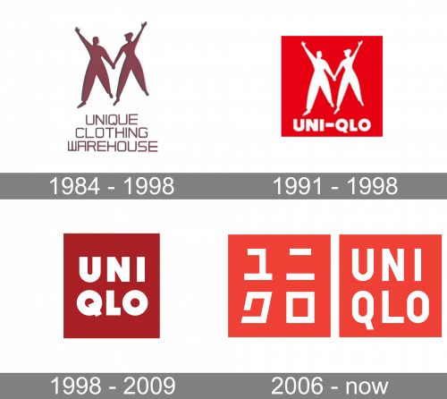
The Uniqlo logo has gone through a single notable update so far. In comparison with its predecessor, the new emblem looks brighter and establishes a clearer connection with Japan.
Meaning and history
Uniqlo was founded in 1949 by Tadashi Yanai, initially under the name “Unique Clothing Warehouse.” The company embarked on its journey in Ube, Yamaguchi Prefecture, Japan, with a clear focus on casual wear that combines quality with value. Through the years, Uniqlo has distinguished itself with several significant achievements, notably its introduction of HeatTech fabric in 2003, a technological innovation that has since become a hallmark of the brand. Additionally, the company’s emphasis on functional, stylish, and affordable apparel has earned it a solid reputation and a robust market position globally.
In recent years, Uniqlo has continued to innovate while also pushing for sustainability and ethical manufacturing practices. Its commitment to quality and continuous improvement has positioned it as a leader in the global fast fashion industry, competing with giants such as Zara and H&M. The company’s strategy focuses on expanding its digital and physical presence worldwide while enhancing customer experience through technological integration and responsive retail concepts.
1984 – 1991

The earliest design featured the original name of the brand, Unique Clothing Warehouse, in a dark, brownish shade of red, which appears similar to the red from the following version. The background was white or of a very light gray shade. The wordmark featured a clean sans serif type based on the square with rounded ends.
The wordmark was either given within a single line or was broken down into three lines.
1991 – 1998
Here, the new company name in English is already used. It is placed inside a dark, wine-red box. The word was broken down into two parts. The lettering “UNI” formed the first line, while “QLO” was placed below.
1998 – 2009
According to the history of Uniqlo described on the official website, the company got a new logo in 1997. It was part of a set of strategies “borrowed” from the US brand The Gap. The strategies included updated merchandise, visual merchandising and display, as well as store design, in addition to the new logo. The logo was developed by Richard Seireeni and Sy Chen of The Brand Architect Group’s Los Angeles office.
2006 – Today
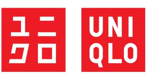 Also, there are quite a few sources explaining that the current red-and-white logo was created in 2006 by Uniqlo’s lead designer, Kawashi Sato.
The design emphasized the link to Japan using three approaches. First, the palette (red and white of the flag of Japan). Also, they added a logo featuring Katakana, one of four Japanese character sets. Katana is typically used for foreign words that have become part of the Japanese language (for instance, the names of brands). In addition to the two ways mentioned above, the company made the new logo look even more like a Japanese ink seal, which also reinforced the link with Japan.
Similar to the old logo, the new English version broke down the word “Uniqlo” into two parts and placed them one above the other. The Japanese version features four hieroglyphs. Kawashi Sato wanted the two versions to be displayed together so as to create a distinctive dual language logo with an international flavor. He said he wanted the design to “represent the so-called ‘Cool Japan’ and embody Japanese pop culture.”
Font
While the original Uniqlo logo featured the Futura Std Extra Bold font, the current one uses a customized font based on the typeface family FF DIN in bold weight. The letters are capitalized, monospaced and centered.
Colors
The most obvious reason why the current emblem is based on a combination of red and white is the link with Japan it creates. Also, this palette has been used by quite a few major brands, so using it is a way to show the company’s ambitions. Eventually, quite a few scientific studies have shown that almost 50% of people prefer red over other colors because it has a positive emotional effect on them.


