Topshop is an iconic brand of affordable fashion and accessories retailing company, which was established in 1964 in London. The brand is extremely popular worldwide especially among teenagers and has more than 500 stores across the globe. The brand is owned by Arcadia Group.
Meaning and history
Topshop is a world-renowned British brand of women’s clothing and accessories that operates on the principle of fast fashion. The brand
belongs to the British concern Arcadia Group, which is the property of Taveta Investments Ltd, owned by Sir Philip Green and his family.
Topshop was founded in 1964 in Sheffield, England.When Jane Shepherdson joined Topshop in 1967 the concept of clothes design changed and the brand started to produce bright and cheerful collections for young girls which made Topshop popular. In 1974 the first Topshop store opened, and twenty years later in 1994, the first combined Topshop and Topman store opened in London’s Oxford Circus, covering 90,000 square meters.
What is Topshop?
Topshop is the name of a very popular British fast fashion brand, established in the middle of the 1960s and owned by Arcadia Group. The brand is specialized in the production of clothes, footwear, and accessories for men and women, with its collection following the latest design trends, and its prices — are very competitive and affordable.
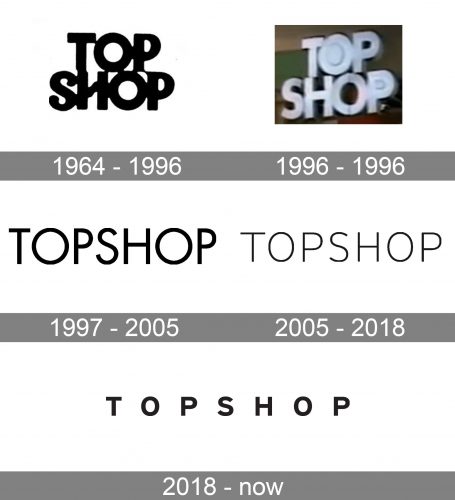
1964 – 1996

The original Topshop wordmark already bore something in common with the current one. It featured glyphs of a rather simple shape, with classic proportions. However, back then, there were a couple of memorable details: for instance, the unusual stroke replacing the middle bar of the “H” and the stroke between the two “P’s.” The type was rather bold and had rounded ends. The most notable difference from the current one, though, was the way the parts of the name were positioned one above the other.
1996 – 1996

The rounded ends were replaced by square ones. The unique stroke in the “H” was gone, too.
1997 – 2005

For the first time, the wordmark is given within a single line. This makes the name of the brand easier to grasp. The additional space between the glyphs has contributed to this result, too.
Also, the type has grown much lighter. It has preserved the circular “O’s,” while the other letters look somewhat narrow in comparison with them. Possibly, this was done to emphasize a visual rhythm and a sort of symmetry created by the “O’s.”
2005 – 2018

The type has grown even lighter. The “O’s” have grown narrower, while some of the other glyphs have become wider. As a result, the wordmark looks transparent, while the letters appear more proportional in comparison with the previous version. None of the glyphs dominate.
2018 – Today

The Topshop visual identity is minimalist and simple, like many other fashion retailers’ logo designs. It makes sense, as the modest yet bold tag looks good on the clothing of any style, and the Topshop fashion assortment has always been very colorful.
The Topshop logo is composed of a wordmark, executed in black and placed on a white background.
The brand uses a bold sans-serif typeface with wide spacing between the letters. All the capitals of the nameplate feature clean rounded lines and straight cuts.
The Topshop logo is perfectly balanced and harmonized. It looks good on tags and packaging, as well as on the brand’s website and advertising materials.
It is a timeless classic, which will always be in trend, and the monochrome palette of the Topshop logo only adds strength and elegance to the whole concept.
Font and Color
The minimalistic uppercase lettering from the primary Topshop logo is set in a heavy geometric sans-serif typeface with strict cuts and distinctive contours of the letters. The closest fonts to the one, used in this insignia, are, probably, Neue Singular H Bold, or Neue Helvetica eText Pro 75 Bold, with the letters placed far from each other.
As for the color palette of the Topshop visual identity, like many other fashion brands the company has chosen a timeless combination of black and white, which is the most minimalistic and strict color scheme possible, yet is as powerful as simple, and evokes a sense of development, progress, and professionalism.


