Unilab (United Laboratories, Inc.) has been known as the largest pharmaceutical company in the Philippines estimated based on its market share. It offers a range of products, from proprietary brands like Biogesic, Alaxan, Conzace, and Enervon to generic ones like RiteMed and Pharex.
Meaning and history
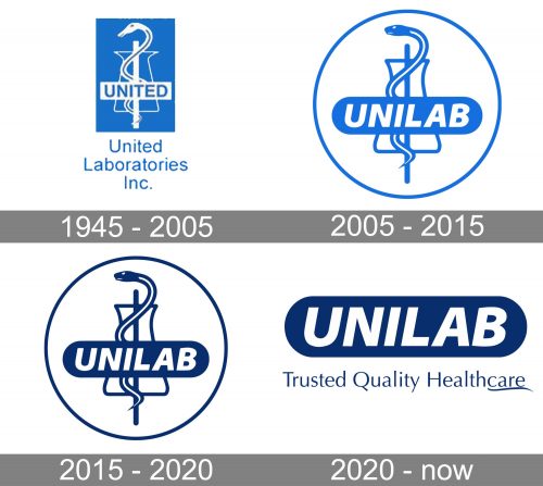
The company began from a tiny drugstore in Manila. It was opened in 1945 under the name United Drug Co. Over the first half a century of its existence, the brand modified its name and used several logotypes.
What is Unilab
Unilab is a Philippine-based private pharmaceutical company. It is headquartered in Mandaluyong, Philippines. Some of its best-known subsidiaries include Pediatricia, Bio-ONCO, Unilab Consumer Health, and Medichem, to name just a few.
1945 – 2005 (United Laboratories, Inc.)
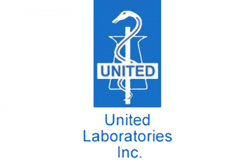
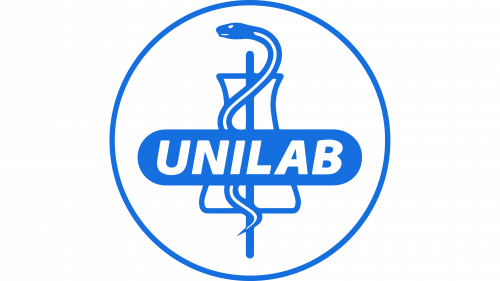
An older Unilab logo already features the Rod of Asclepius, an ancient symbol of medicine and healthcare. It is a serpent-entwined rod wielded by Asclepius, who was a hero and the god of medicine in ancient Greece.
Hundreds of organizations and services, large and small, across the globe use the rod of Asclepius as part of their visual brand identity. Creating a unique logo with such a universal symbol is a challenge. The designer who worked on this project decided to combine the snake with a laboratory tube.
In all honesty, we can’t say that the result looked very beautiful or refined. To make matters worse, the tube did look like a hat turned upside down, the result being an uncanny resemblance to the magician’s hat. So, such a logo could have belonged to a conjurer or even a snake charmer.
Given the circumstances, the full name of the brand, which could be seen below, was necessary. Also, there was an early attempt at an abbreviated wordmark – you can see the word “United” in the middle of the emblem. While this effort might seem amateurish and ineffective, it was a step towards the sleek and meaningful short name used now.
2005 – 2015 (Unilab)
The updated Unilab logo did a better job. Gone was the magician’s hat, and a minimalist tube replaced it. The snake was redrawn and adopted an elegant and streamlined head. The darker shade of blue created a more pronounced contrast, which made the design easier to grasp.
The word “Unilab” was set in a modern type with a dynamic touch. It was placed inside an ellipsoid, which made it look more refined and professional than in the previous logo. On the downside, the wordmark was positioned right in the middle of the emblem. As a result, it overshadowed the picture making it more difficult to grasp and hiding the curvy shape.
In a way, the rod and the wordmark looked like parts of different pictures that just happened to be in the same place by coincidence.
2015 – 2020
The color was made darker, which resulted in enhanced contrast and legibility.
2020 – present
The design was simplified. Gone were the rod of Asclepius, the ring, and the tube, and only the wordmark could be seen in the logo now.
On the one hand, the emblem might have lost some of its individuality. However, we can say that both the rod and the tube are such generic symbols that there is no need to mourn that loss.
Anyway, the “medical” meaning is still there in the logo and is still obvious. It is reflected in the second part of the name of the brand, “lab.” When the emblem comes with the “Trusted Quality Healthcare” tagline, this theme is even more prominent.
If not unique, the logo looks dynamic and modern.
Colors and font
The navy blue doesn’t have a strong association with healthcare, but it’s a color that conveys reliability and loyalty, which is good for the brand. The austere sans makes the Unilab logo perfectly legible.


