The Ukrainian Premier League stands as the apex of professional football within Ukraine, operating at the pinnacle of the nation’s football pyramid. Founded in 1991, it serves as the top-tier football league, showcasing the talents of Ukrainian clubs and players. With fervent fan bases and a rich history, the league has become integral to the country’s sporting identity.
Meaning and history
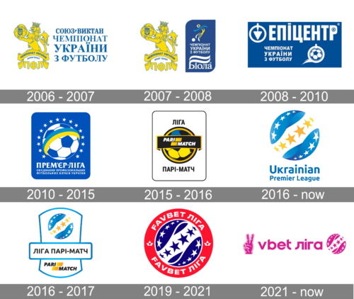
Ukrainian Premier League, the country’s top football league, dates its history to 1991. An old Ukrainian Premier League logo featured a football in white and dark blue with two ribbons in the colors of the Ukrainian flag, yellow and sky blue. Around the football, a row of small stars could be seen.
What is the Ukrainian Premier League?
It stands as the foremost football competition in Ukraine, showcasing the country’s top clubs and players. With its foundation in 1991, it symbolizes Ukraine’s sporting independence and has garnered international recognition. Passionate fans, rich history, and top-tier talent define this league.
2006 – 2007
A golden lion with a football ball holds a Ukrainian symbol. Underneath, the king of animals there is a golden ribbon that says “Ukrainian Championship” with the year of the event underneath. To the right of this majestic emblem, the logo has “Ukrainian Football Championship” printed in blue, serif letters with the sponsor’s name above it. The color palette of the emblem reflects the national colors.
2007 – 2008
The previous logo was updated to reflect the new sponsorship with the logo of the sponsor added underneath the name. The name no longer was printed using such a large font and was instead placed on a blue rectangular background with two opposite corners being rounded. There was a new element in this logo it was an abstract drawing of a football player done in national blue and yellow colors.
2008 – 2010
The sponsor was changed again and its name was placed in large letters across the top of the new emblem. The name was printed in the lower left corner using the same font and split into three lines as in previous logos. A flying football ball to the right of it added dynamics and made it clear what the event was all about. Unlike the previous versions, the logo did not have a yellow color, which instantly crossed out the association with the Ukrainian flag.
2010 – 2015
This logo was used for five years, which is relatively long compared to the previous logos. The Ukrainian identity was brought back in the form of a blue and yellow strip that wrapped around the football ball in the center of the logo. An almost full circle around the ball was made up of white stars reflecting the championships of the league. Under the ball, it said in bold, serif lettering “Premier League” with “Association of Professional Football Clubs of Ukraine” printed in smaller font in two lines right underneath. The blue rectangular background gave the logo a professional and confident appearance.
2015 – 2016
The football ball was the center of the logo once again. However, this time it featured a bolder look thanks to black elements. It also had blue and yellow colors, which are the colors of the Ukrainian flag. Across the ball, there was a black banner with a white frame and the sponsor’s name. The rectangular background was now a white color and just had a thin black frame. Above the ball, it said “League”, while the sponsor’s name was printed in Ukrainian underneath it. The logo had a powerful and daring look.
2016 – Today
In this logo, the designers decided to remove the background altogether. Although the ball was still the main element, it did not look like a football ball and looked more like a globe. It was done in various gradients of blue and had five white stars placed along the border on opposite sides. A white strip ran diagonally across it, featuring yellow stars. Just like a few of the previous logs, this logo used the colors of the Ukrainian flag. For the first time in history, the logo had the name of the league printed in English instead of Ukrainian. This fact reflected the growing popularity of its teams.
2016 – 2017
During the 2016-2017 season, the league added the sponsor’s name to the emblem. It was printed on a banner running underneath the yellow ball. The logo of the sponsor was added under the banner. This logo looked light and professional.
2019 – 2021
The following version of the UPL logo was basically a ball divided into three fields: two blue fields and a white field in between. The blue fields housed white stars, while the white field housed yellow stars (once again, a reference to the colors of the country’s flag). Below the ball, the full name of the league in Ukrainian could be seen.
2021 – Today
This logo looks nothing like the previous version as it featured a bright pink and white color palette. The only element that drew a connection to the familiar image of the Ukrainian Premier League was a ball/globe with stars. With “League” printed to the left of it. A sponsor’s name and symbol were placed on the left. The logo turned out balanced, while the pink instantly attracted attention.


