UFC is an abbreviation standing for the Ultimate Fighting Championship, which is a promotional company, established in 1993 by Endeavor Group Holdings. One of the world’s most famous companies in mixed martial art events is based in Las Vegas and has held more than 500 fights by today.
Meaning and history
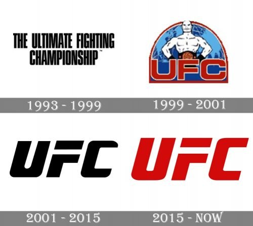
The UFC visual identity history features three major redesigns, which brought completely different styles and images to the company, pointing to its diversity and progressing.
1993 — 1999
The original visual identity of UFC was introduced in 1993 and composed of two parts, which were used separately. The official logo featured just a black narrowed inscription set in two levels, with the lettering executed in a modern sans-serif typeface with straight clean lines.
As for the graphical part of the visual identity, there was an additional emblem, used by the company. The blue and gray gradient hexagonal frame with a carbon-pattern background had a multi-color image on it. The green and blue globe with a smooth yellow ribbon crossing it, had a white fighters figure above it and his fist enlarged. The red inscription was placed on the yellow banner, using the same narrowed sans-serif as in the primary logo version.
1999 — 2001
The redesign of 1999 brought a new image to the UFC visual identity, placing the “white fighter” on blue background above the red geometric lettering in a thin white outline. The upper part of the badge was arched, resembling a stage. Though this emblem only stayed with the company for two years, it was a bright and memorable badge.
2001 — 2015
In 2001 the logo of the UFC was simplified to just an inscription in a custom smooth sans-serif. The logotype was usually executed in monochrome, but sometimes turned gold and gained gradient shades to add volume and dynamics to the three-dimensional version of the badge.
2015 — Today
The current version of the UFC logo was introduced in 2015 and is fully based on its previous version, just with the contours refined. The new red and white color palette sometimes gains silver accents and looks powerful and passionate.
Font and color
The bold italicized UFC logotype is written in a custom sans-serif typeface with the upper horizontal bar of the letter “F” separates from the body. The massive letters in thick clean lines look similar to such fonts as Quub Black Italic and Venus Rising Bold Italic, bitch with their contours modified.
The red and white color palette of the UFC visual identity stands for strength and power, for courage and determination. This bright combination brilliantly reflects the purpose of the company, evoking a sense of danger and masculinity.


