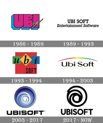
The French video game company Ubisoft Entertainment SA has gone through at least six distinctive logotypes. It’s a lot, considering that the history of the brand started only in 1986. In most cases, the design was changed completely, so that was a series of revolutions rather than an evolution.
Meaning and history
Ubisoft Entertainment is a French company specializing in the development and publishing of computer video games, headquartered in Montreuil, France. The company includes studios in more than 20 countries, including Russia, Canada, Spain, China, the United States, Germany, Bulgaria, Ukraine, Romania, and Italy. Ubisoft is one of the largest game publishers in Europe.
Ubisoft was founded by the Guillemot brothers in 1986 in France. At the end of the decade, Ubisoft expanded into other game markets, including the United States, the United Kingdom, and Germany.In 1994 Ubisoft opened its game development studio in Canada. Later, the Studio in Montreal became their main office. In 1996 Ubisoft opened additional offices in Shanghai and Montreal.In 2000 Ubisoft acquired the American studio Red Storm Entertainment, and in 2001 – Blue Byte Software. Since then the company keeps growing and progressing, adopting new technologies for its products.
What is Ubisoft?
Ubisoft is a French video games developer and publisher, which was established in the middle of the 1980s, and today has its studios in more than 20 countries across the globe. Ubisoft is one of the world’s top ten companies in the video games segment by revenue and market capitalization.
1986
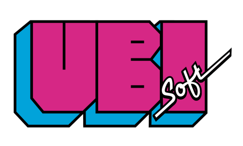
The five sons of the Guillemot family founded a company and named it Ubi Soft Entertainment S.A. The original Ubisoft logo combined huge lettering “UBI” in purple and blue with a little inscription “Soft” in a cursive script inspired by handwriting.
1989
In the following version, both the words were given in the same font. It was much simpler than its predecessor, with serifs. The lettering “Entertainment Software” in italics was added below. There were no other colors other than black and white.
1993
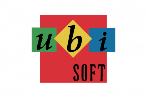
Once again, both the palette and shape of the logo were completely changed. Each of the letters, the “U,” “B,” and “I,” were now given inside small squares colored green, yellow, and blue respectively. In the background, there was a large red square, which also housed the word “Soft.” The lettering was black. The glyphs on the top were lowercase italics, while the word “Soft” featured elongated uppercase glyphs.
1994
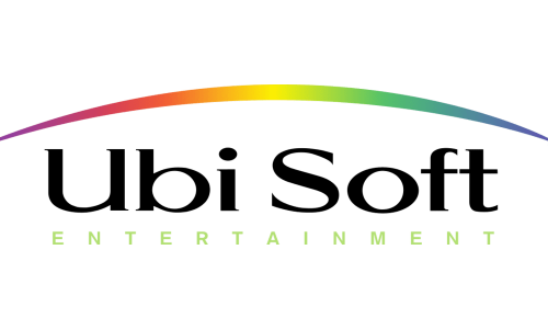
The so-called rainbow arch logo was introduced simultaneously with the release of the Rayman game. Here, the name of the brand featured the same type and was positioned horizontally within a single line. The font was a rather elegant sans with strokes of various thicknesses.
2003
The era of the swirl logo started. The new design reflected the change of the brand’s name to Ubisoft. It was supposed to symbolize a company that had grown more mature and was now oriented at an older audience. It partly reflected an important event in its history, the acquisition of the Tom Clancy license.
2017
The mystic blue gradient disappeared from the Ubisoft logo leaving a plainer black-and-white swirl. The brand called it “minimalist, modern, and monochromatic.” The flat image is in line with current design tendencies respecting simplicity and 2D designs. What’s even more important, this simplicity also means endless possibilities of customization. The company explained that in each title’s boot sequence, the emblem was colored and animated to reflect the design of the game.
The “eye” and the “O” glyph leave an impression of hand-drawn shapes. This is supposed to symbolize a human touch, as well as the “enthusiasm, curiosity, and the grain de folie (‘touch of madness’ in French) that Ubisoft is known for.”
Font
While the type may look generic, it has a unique touch due to the “hand-drawn” letter “O.”
Colors
Although the main Ubisoft logo is monochromatic, various colors are added to it, when it is used in the company’s products.


