U-Haul is an American moving and storage rental company, founded by Leonard Shoen in Ridgefield, Washington. Born out of Shoen’s own need to move his belongings at an affordable cost, U-Haul revolutionized the self-move industry by offering trailer and truck rentals directly to consumers. Its creation allowed individuals and families to rent equipment on a one-way or round-trip basis, making moving more accessible and cost-effective across the United States and Canada.
Meaning and history
In 1945, amidst a post-war America, Leonard Shoen coalesced a groundbreaking idea into reality in Ridgefield, Washington, birthing U-Haul. Recognizing a gap in the market for affordable DIY moving solutions, Shoen started with a mere $5,000 investment, ingeniously constructing rental trailers and stationing them at gas stations, thereby laying the foundational stone for the self-moving industry. U-Haul rapidly transcended its humble beginnings, expanding its fleet and services to cater to a burgeoning clientele seeking autonomy over their relocation needs.
This innovative model democratized moving, allowing individuals to transport their possessions affordably across vast distances. As decades unfolded, U-Haul evolved, incorporating trucks, storage solutions, and an array of moving supplies, etching its name as a stalwart in North American moving and storage services.
Through resilience and a customer-centric approach, U-Haul has navigated challenges and technological shifts, steadfastly serving communities with its orange and white emblem as a beacon of moving freedom.
What is U-Haul?
U-Haul stands as a pioneering entity in the DIY moving industry, offering a fleet of trucks, trailers, and other equipment to facilitate the self-relocation needs of individuals across North America. Birthed from Leonard Shoen’s vision in 1945, this company has grown into a synonym for affordable, accessible moving solutions, empowering countless families and businesses to chart their own journeys with ease and reliability.
1945 – 1953
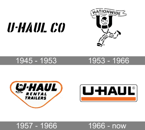
The logo presented embodies a stark, high-contrast black and white palette, with the name “U-HAUL CO” depicted in bold, fragmented typography. Its rugged, stencil-like letters convey a sense of robustness and practicality, resonating with the brand’s utilitarian ethos. The varying letter thickness and disjointed style suggest movement and dynamism, echoing the company’s core business of moving and transportation services. This logo is straightforward yet distinctive, a visual shorthand for the brand’s reliable, do-it-yourself spirit.
1953 – 1966
This rendition of the U-Haul logo introduces a playful character, encapsulating the company’s friendly service approach. “NATIONWIDE” arches above, signaling expansive reach, while the figure cleverly forms the ‘U’, adding a human touch to the brand. The logo’s evolution brings a whimsical energy, with the character seeming to stride confidently, the brand’s dynamic and customer-oriented progression. Typography beneath the figure retains the boldness, yet with a more cohesive and streamlined appearance, embodying a balance of tradition and forward motion.
1957 – 1966
Transitioning from its earlier versions, this logo encapsulates U-Haul’s identity within a guitar pick-like shape, signaling a more defined brand boundary. The familiar character remains, now seated inside the ‘U’, infusing the logo with a sense of cheer and approachability. Below, “RENTAL TRAILERS” is clearly stated, specifying the company’s service, a direct nod to its core offering. The orange border exudes warmth and energy, a visual cue for the brand’s approachable and vibrant service ethos.
1966 – Today
The latest logo iteration presents a minimalist and modern design, focusing on clean lines and bold lettering. The playful figure and detailed text are retired, manifesting a shift towards a more streamlined and corporate aesthetic. A singular orange stripe underlines the brand name “U-HAUL”, which now stands out in a stark, uniform font, suggesting a refined brand identity that emphasizes strength and efficiency. The encapsulating rectangle frames the logo, signifying structure and stability, hallmarks of the company’s service promise.


