

![]() PNP Logo PNG
PNP Logo PNG
The brand identity of the Philippine National Police (PNP) is represented in its seal and badge. Both include several symbols, the meaning of which is connected with the country’s history and national symbolism.
Meaning and history
![]()
The history of the national police forces of the Philippines can be traced back to the pre-Hispanic times. Back then, there were soldiers responsible for enforcing local laws. During the Spanish rule, policing duties were performed by the Spanish army and local militias. In 1901, the Philippine Constabulary and the Manila Police District were created.
Later, these forces merged with the Armed Forces of the Philippines. Eventually, in 1990, the Philippine National Police was founded as the result of the merger of two old organizations: the Constabulary and the Integrated National Police.
1901 – 1975
![]()
The very first logo was designed for the National Police Forces of the Philippines in 1901, and stayed with the structure for more than 70 years. It was a clean and bright badge, which looked pretty cool and modern, despite the use of historical and heraldic elements, and a traditional color palette. It was a classic crest in a thick white frame with green laurel leaves along it. The central part of the crest was colored navy blue and has a golden image with a kind of an axe on it. The top of the crest was decorated by a smaller circular element with a red background and a white silhouette of a knight in his armor.
1975 – 1991
![]()
The redesign of 1975 has introduced a more ornate badge, with a lot of gold elements. It was still based on a shape of a traditional crest, but the framing got darker and now featured deep green shades of the leafy ornament, and the top part was now composed of three peaks with one golden five-pointed star in each of them. The outline of the upper part was set in bright yellow, and the body boasted a new tricolor — white, blue and red. The central part had a golden medallion with an engraver knight on it, and a ribbon with the black “INP” monogram in the uppercase of a modest sans-serif typeface.
1991 – now
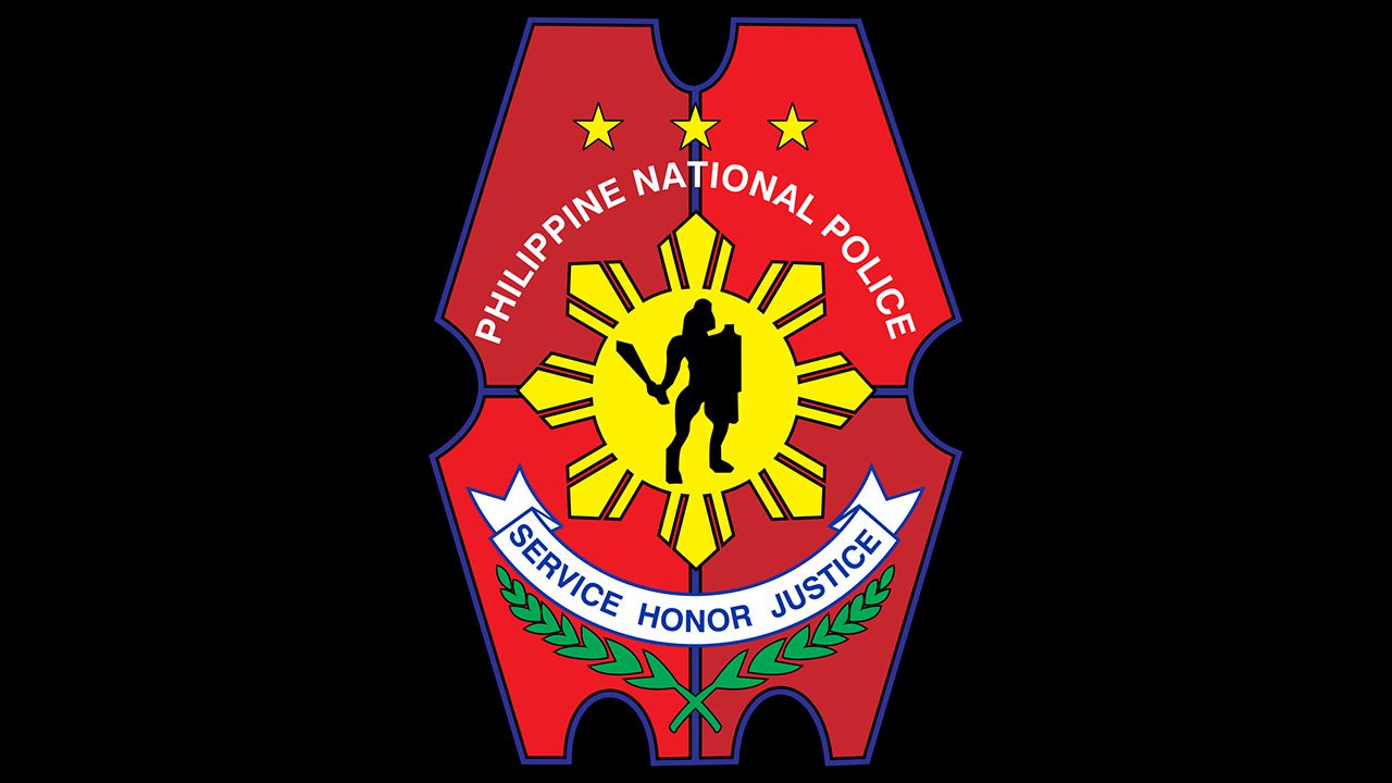
![]()
In 1991 the PNP logo gets another redesign, with the classy crest turning into a geometric figure with two arched cut-outs in the sides and mirrored top and bottom parts with smaller cut-outs, which makes the logo look like an old-style ticket. The new badge is set in a dark red and scarlet red color palette with a bright yellow medallion in the center. The black knight silhouette is drawn over the sun-shaped medallion, and the lettering is placed both above and under it. The inscription above is set in the uppercase of a sans-serif font with white lines, and the bottom part is written along a white ribbon, outlined by a green leafy ornament.
Symbols on the seal
The central element of the seal is a male figure holding a shield and a sword. This is Lapu-Lapu, the legendary ruler of the Mactan island. He became the country’s national hero after the Battle of Mactan (1521) when his army defeated Portuguese occupants led by the explorer Ferdinand Magellan. Magellan was killed, and as a result, the Spanish occupation was delayed by more than four decades. According to the official PNP’s explanation, Lapu-Lapu represents civilian constitutional authority.
Each of the 14 laurel leaves stands for one of the 14 Regional Commands. Also, it implies that public service is an organization with a noble mission. Another essential element, the shield, is used as a visual representation of the Philippine Constabulary, the first National Police (1901), the organization that existed for almost a century.
The three stars represent the three main geographical divisions (Luzon, Visayas, Mindanao) of the Philippines as well as the 1,700 islands.
The gold sun is the symbol of the evolution of the PC and INP into the larger and more complex institution, PNP. The eight sunrays are the provinces that revolted against Spain.
Below the central element, you can see a white banner housing the lettering “Service Honor Justice,” while the full name of the organization is given in white letters positioned above the sun.
Emblems on the badge
The core symbols of the badge are the same as those featured on the seal, but there’re also quite a few additional details.
Once again, you can see Lapu-Lapu, the shield, the three stars, the laurel leaves, and the eight sunrays. While all these bear the same symbolism they represented on the seal, their visual representation is somewhat different. The reason is pretty simple: the new material, metal, has more requirements, so the designers of the badge had to adapt the image for this surface.
In addition to the symbols from the seal, there’s the Philippine monkey eating eagle. The eagle dominating the PNP logo is the national bird, which represents such qualities as speed, ferocity, power, braveness, and immortality.
The central part of the badge and the eagle are gold. You can also see the words “Philippine National Police” in gold placed inside a red ring, which goes around the shield. Right below the eagle’s head, there’s a white banner housing the lettering “Officer.” Eventually, under the shield, another banner is positioned. This one houses an individual number.
We should point out that the symbolism of the police badge and seal is closely interrelated with that of the country’s national flag. On the flag, you can also see the sun with eight rays and the tree stars. The rays look pretty similar to those on the PNP logo. The colors – gold and red – seem to have been borrowed from the national flag. Such a metaphoric link appears pretty logical as it reflects the physical connection between the country and its police system.
Font
![]()
The lettering “Philippine National Police” on both the badge and the seal is given in a simple and perfectly legible sans serif typeface. The words “Service Honor Justice” seem to utilize the same (or at least very similar) font. The word “Officer” seen on the badge is given in a different type. While the glyphs also possess classic proportions, this time it’s a serif font.
Colors
Both the seal and the badge are dominated by red and gold (inspired by the National flag) with minor black elements. However, in case of the seal, gold is just a shade of yellow, while in the case of the badge the “gold” part looks like metal. The white on the seal correlates with a lighter metal shade on the badge. Eventually, the seal also includes green as the most natural color of the laurel leaves.


