Tylenol is a brand of pain-killer drugs, which was introduced in 1955 by McNeil Laboratories, a family owned pharmaceutical manufacturer. The brand name is owned by McNeil Consumer Healthcare, a subsidiary of Johnson & Johnson.
Meaning and history

For decades Tylenol has earned credibility by putting consumers and medical professionals first. Tylenol’s response to the 1982 counterfeiting incident is worthy of inclusion in crisis management textbooks. The company began shipping counterfeit-proof products, and that’s how medical products are now sold around the world.
Today, Tylenol combines brand value with innovation, efficiency and empathy. During COVID-19, Tylenol launched the “Stay Home for Them” campaign, becoming the first to recognize the value of medical staff efforts, including direct support for the American Nurses Foundation and free product delivery to communities and hospitals in need.
Like “Paracetamol” and “Acetaminophen”, the brand name Tylenol comes from the chemical name of the compound, N-acetyl-paraaminophenol (APAP). The brand name is owned by McNeil Consumer Healthcare, a subsidiary of Johnson & Johnson.
What is Tylenol?
Tylenol is a brand of medication advertised to reduce pain by reducing fever and relieving symptoms of allergies, colds, coughs, headaches and flu. The active ingredient in its original flagship product is paracetamol (known as acetaminophen in the United States), an analgesic and antipyretic.
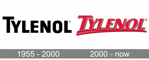
1955 – 2000

The initial long-time logo depicted the brand’s wordmark, and that’s all. It used bold sans-serif letters with straight, uniform lines. It was usually completely black to relay seriousness and austerity.
2000 – Today
The brand name Tylenol and the United States Adopted Name acetaminophen were generated by McNeil from the chemical name of the drug.
The Tylenol logo is a bold and intense wordmark. It’s bright red color makes the brand very recognizable and reflects the aim of the medicine — to relieve pain and reduce fever.
The red color has always been one of the brand’s most important visual elements. When the brand just launched in 1950s, to avoid competing with aspirin, they marketed it as a product to reduce fever in children, packaging it like a red fire truck with the slogan, “for little hotheads”.
Font and Color
The sharp and bright lettering from the primary logo of Tylenol is set in a modern distinctive typeface with flared ends of the bars. The closest fonts to the one, used in this insignia, are, probably, Columbia Serial Heavy Italic, or Sigvar Serial Heavy Italic.
As for the color palette of the Tylenol visual identity, it is based on the combination of red and gray, where red represents the pain, which the medication aims to fight with, and shows its efficiency and strength, and gray symbolized professionalism and reliability of the brand.


