TVN Chile is the name of the largest Chilean broadcasting company, which was established in 1969 by the order of President Eduardo Frei Montalva. Today TVN Chile is a publicly owned company, which operates not only in Chile but all over the globe.
Meaning and history
TVN Chile was established at the end of the 1960s after the President of the country issued a direct decree. A few months later, in 1970, the government accepted the law, which established that the new company had to be public and autonomous. Nothing has changed since then.
Today TVN hike is one of the leading broadcasting corporations not only in its country, but in the whole Latin American region, with several products in Television, Internet, and Music segments, and the service area spreading far away from the borders of Chile.
What is TVN Chile?
TVN Chile is a Chilean broadcasting corporation, founded by the President’s order at the end of the 1960s, and growing into one of the counter’s most reputable companies by today. The services of the company include Television, Music, and Online platforms.
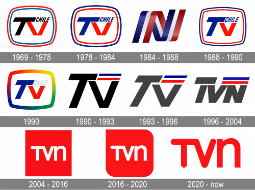
In terms of visual identity, TVN Chile has never been unconfident or modest, as can be seen in the number of the company’s redesigns, held throughout the years — the logo portfolio of TVN counts more than ten versions.
1969 – 1978
The very first logo for TVN Chile was designed in 1969 and stayed untouched for almost a decade. It was a stylized black and red “TV” lettering with a small slanted “Chile” let in the narrowed sans-serif font above the “V”. The letters were set on a plain white background and enclosed into a blue, white, and red frame with the sides arched from the center, resembling a shape of an only tv screen.
1978 – 1984
The redesign of 1978 switched the black elements of the badge into blue ones, which made the whole badge look more balanced and harmonized. The “Chile” wordmark was slightly enlarged and emboldened, making the whole composition more stable and professional.
1984 – 1988
In 1984 the TVN Chile badge gets another redesign, and this time it was a completely different concept. It was a three-dimensional uppercase letter “N” stylized as a wide ribbon in blue, white, and red, with a slightly glossy surface. The vertical bars of the letter were slanted to the right, creating a feeling of progressive motion, and reflecting the approach of the company.
1988 – 1990
The redesign of 1988 has brought back the original TVN Chile logo in a blue, red, and white color palette, with the shades brightened up, and the typeface of the “Chile” wordmark switched to a more geometric and brutal one, with square contours and wrap angles of the characters. This badge stayed with the company for another two years.
1990
For a few months in 1990, the company decided to try on a new color palette, emboldening the frame of the badge and drawing it in a gradient rainbow scheme. As for the main elements of the badge, the capital letters remained blue and red, and the “Chile” turned light greenish gray, almost invisible on a white background.
1990 – 1993
The more minimalistic version of the TVN Chile logo was introduced by the company in 1990. It was a sharp uppercase “TV” in bold black lines, set against a plain white background with no framing, but with a small graphical addition — a tricolor horizontally stretched flag above the right bar of the “V”.
1993 – 1996
The redesign of 1993 has enlarged the drag on the TVN Chile badge and switched the colors of the capital letters from black to gray, which made the tricolor the main element of the composition. This version stayed active for three years.
1996 – 2004
In 1996 the blue and red stripes on the flag got thicker and the whole tricolor was extended even more, as one more letter appeared on the badge, the “N”. It was placed on the right part of the logo, under the flag, and featured the same height as the “V”, while the first “T” had its horizontal bar on one level with the horizontally-stretched flag.
2004 – 2016
The new era of the TVN Chile visual identity started in 2004, with an absolutely different style and color palette adopted for the badge. The new logo featured a solid red square with white lettering in two different fonts written over it. The “TV” part was executed in a rounded sans-serif, with the capital characters connected, while the lowercase “N”, set in the same size, was placed separately and used a cleaner font with straight cuts of the lines.
2016 – 2020
The redesign of 2016 worked with the shape of the main elements of the TVN badge — the red square. With this refinement, three out of the angles of the banner got rounded, and only an upper left one remained sharp and distinctive. This made the logo look more like a stylized drop, but also made it look much more modern when used as a mobile app or web icon.
2020 – Today
In 2020 the TVN Chile logo gets another redesign, with the style of the lettering kept untouched, but the concept changed. Now the logo featured three red letters set against a plain white background with no additional graphical or even framing. The very minimalistic yet bright badge represents the professional and progressive approach of the constantly growing company.
Font and color
The recognizable lettering from the primary TVN Chile logo is set in two different styles: the uppercase “TV” in a bold rounded sans-serif, and the lowercase “N” in a traditional geometric font. Both parts of the inscription are set in custom fonts, based on simple sans-serifs.
As for the color palette of the TVN Chile visual identity, it is based on a powerful and intense combination of scarlet-red and white, which evokes a sense of confidence, strength, and motion.


