Story Media Group, headquartered in Toronto, is a prominent global content producer and distributor for children’s animated and live-action content. Owned by ZM Capital and Neil Court, the company has garnered recognition for its engaging storytelling and innovative animation. Branching out beyond its Canadian borders, 9 Story has made its mark internationally, with operations in New York, Dublin, Manchester, and Bali. With a rich portfolio, the company has partnerships across television networks and digital platforms worldwide, solidifying its reputation in the children’s entertainment sector.
Meaning and history
Founded by Vince Commisso and Steven Jarosz in 2002, 9 Story Media Group has rapidly evolved to become a leader in children’s entertainment. From its inception, the company focused on producing and delivering high-quality animated and live-action content. Over the years, its achievements include securing partnerships with major broadcasters, acquiring prominent brands, and expanding its global footprint. Today, with a diversified content portfolio and a strong presence across various platforms, 9 Story stands at the forefront of the children’s media landscape, continuing its journey of creativity and excellence.
What is 9 Story Media Group?
9 Story Media Group is a leading international children’s content producer and distributor based in Toronto. Renowned for its animated and live-action series, the company has consistently delivered engaging stories to audiences worldwide, solidifying its place in the global entertainment industry.
2002 – 2007
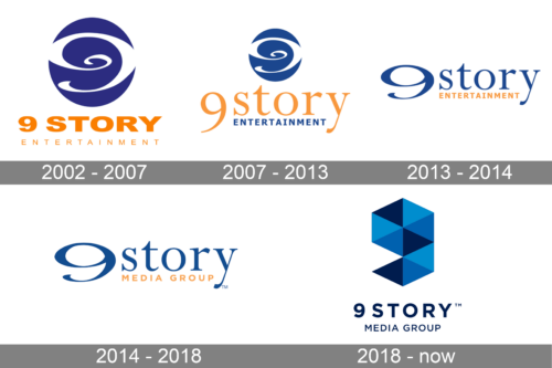
The logo for “9 Story Entertainment” ingeniously combines vibrant color play with sophisticated design. Dominated by a rich hue of blue, the abstract swirl design evokes thoughts of a galaxy or a portal, suggesting infinite possibilities and depth. The number “9” seamlessly integrates within the swirl, underscoring the brand’s name and establishing its distinct identity. Beneath the emblem, the company’s name is written in a complementary orange, lending a burst of energy and contrast. Overall, this logo serves as a window into the world of imaginative storytelling and boundless creativity.
2007 – 2013
A slight deviation from the primary design, this alternative “9 Story” logo exudes elegance and simplicity. The dark blue is consistent, giving the design cohesion and class. The abstract swirl remains, but this iteration focuses more on a fluid transition between the “9” and the design element. With the words “story” placed adjacently in a clear, bold typeface, it emphasizes the brand’s commitment to narratives, giving the design a sense of purpose and direction.
2013 – 2014
The “9 Story Entertainment” logo is a harmonious blend of classic elegance and modern flair. The number “9” is sculpted in a sweeping, fluid blue form, resembling both a numeral and an artistic flourish. The word “story” follows, rendered in a lowercase typeface that balances the weight of the number. Its golden hue contrasts with the blue, creating a visual symmetry. Below, “Entertainment” is penned in a more reserved font, grounding the logo and emphasizing the brand’s core focus. Together, they form a cohesive emblem, portraying both creativity and professionalism.
2014 – 2018
This variant of the “9 Story” logo takes a more linear and expansive approach. The familiar blue swirl representing the number “9” stretches horizontally, merging seamlessly with the word “story” in a fluid cursive style. Beneath this combination, “Media Group” is printed, announcing the brand’s diverse media endeavors. The use of deep blue and the inclusion of the trademark symbol lend the design an authoritative and established feel while maintaining its inherent artistic charm.
2018 – Today
Breaking away from the previous curvaceous designs, this rendition for “9 Story Media Group” adopts a geometric approach. A three-dimensional cube, intricately folded, takes center stage. Comprised of varying shades of blue, the design gives an illusion of depth and movement. The cube’s facets and angles can be interpreted as different narratives or stories, a nod to the brand’s storytelling prowess. Positioned below is the company’s name, with “9 STORY” in bold and “Media Group” beneath. The typeface is modern and clean, complementing the structured cube while asserting the brand’s contemporary vision.


