Tutanota is the name of an encrypted email provider from Germany. They are positioning themselves as a secure alternative to Gmail. According to their website, they also plan to include calendar, notes, and cloud storage in their offering – and of course, all of these features will also be encrypted.
Meaning and history
Tutanota, created in 2011, by today has grown into something more than just an email service. It is in some way a symbol of freedom, and rights for privacy, the truly progressive provider, which evolves daily and implements new services and technologies for its sunsets to feel more safe and comfortable.
What is Tutanota?
Tutanota is the name of an email service platform, which was launched in 2011. The German webmail service is known to be one of the safest platforms on today’s market and has more than 2 million users from all over the globe. The encrypted email service is subscription-based.
2011 – Today
The visual identity of Tutanota, created in 2011, is different from all other logos of e-Mail service providers we can see. First of all, it is of course due to the use of a non-standard for the segment color palette, which in Tutanota’s case in burgundy and white. Burgundy is known as a royal color, most often seen on traditional heraldic emblems and standing for nobility and courage. As for the white, it represents transparency and loyalty, which is pretty logical for the purpose of the software.
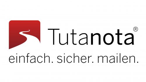
The Tutanota visual identity is composed of a square emblem, which can be used on its own, as an icon, or set on a solid burgundy background on the left from the white logotype, and above a lightweight narrowed “Encrypted Open Source Email Service” tagline.
The emblem features a square with rounded angles, executed whether in burgundy or white (depending on the placement), with one element drawn on it — a smooth curvy line, depicting a road.
Font and color
The elegant yet modern title case logotype from the primary badge of the encrypted email service from Germany, Tutanota, is written in a clean and neat sans-serif typeface with full-shape letters and traditional cuts of the lines. The closest font to the one used in the Tutanota logo is, probably, News Gothic No. 2, with the first part in Thin style, and the second — in Medium.
As for the color palette of the Tutanota logo, it is composed of a white and red for the emblem, and black for the logotype, — the most classic and powerful tricolor in the world of visual identity design. The combination of red and white evokes a sense of power and confidence, while black lettering emphasizes the professionalism and reliability of the service.


