Turo is a car-sharing service, which was established in 2010 in the United States. Today the company from San Francisco is one of the national leaders in the segment and has almost 15 million users with more than 400 thousand cars in its catalog.
Meaning and history
Turo is a company, engaged in the Carsharing industry, which means, it offers its clients a car rental service through the app. The car can be taken on the street, from the closest location to the client, and left wherever it is convenient. All the registration and transaction processes are automatized, and the only thing you need to use the service is your mobile phone with the Turo application downloaded.
The company was established in the United States, but is already available in many countries across the globe, making up a strong competitor to such popular taxi services as Uber, Lyft, and Bolt.
What is Turo?
Turo is an American company, that provides car-sharing services. The company was established in San Francisco in 2010, and today its application is available in almost 60 countries across the globe, allowing people to rent vehicles online in seconds.
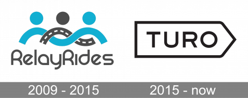
2009 – 2015

The first name of the company, which is today known as Turo, was RelayRides, so the logo, used by it during the first five years, was based on the original naming, and featured a pretty complicated design with lots of graphical elements. The logotype, set in a custom designer sans-serif font, was written in gray letters under an emblem, drawn in gray and blue. The emblem featured an image of three stylized figures with three solid dots replacing three heads and two wavy intertwined lines for shoulders and arms. The lines looked like two roads, reflecting the purpose of the company.
2015 – now
The visual identity of a young and progressive American company is just an exact graphical reflection of its spirit and character. It is minimalist, contemporary, and memorable.
The Turo logo is composed of a clean and simple wordmark, placed inside a geo-metric figure with a bold black outline. The capital letters of the inscription are exe-cuted in a laconic yet stylish sans-serif typeface, which is very similar to such fonts as ITC Blair Pro Medium and The Pretender Exp Sans.
The letters in black are placed over a white background and have enough space between each other to create a light yet solid and confident feeling.
As for the main hero of the visual identity, the framing, it is composed of a horizon-tally stretched pentagon with its triangular side pointing to the right, as an arrow.
Looking like a road sign, it also represents future and movement, so here the two meanings are hidden — the “road”, transport segment of the company and its main purpose, and its spirit and progressive approach — using the latest technologies and providing their customers with the best services.
Font and color
The minimalistic uppercase lettering from the primary Turo logo is set in a clean and modern sans-serif typeface with distinctive contours and shapes of the characters. The font, used for this insignia, is very close to such types as Bristone Reg and Rexton Medium.
As for the color palette of the logo, the American car-sharing company uses a timeless black-and-white scheme, which elevates the laconic design of the badge, strengthens it, and makes the badge look stylish and sleek.


