Barstool Sports is the name of a popular media company, established at the beginning of the 2000s by Dave Portnoy. The company is specialized in the creation and production of sports-related content and has it broadcasted via online platforms.
Meaning and history
Barstool Sports is not a young name in the world of digital media, but it is quite progressive and edgy, keeping its content on top of all trends and its audience highly involved and interested.
Barstool is the brand, that is engaged in the production of various sports-related content, which can be seen on various online platforms, including web and applications, which today has expanded to podcasts and radio stations, but it also has its audience on TV.
Established in the United States, Barstool Sports today is known and loved by millions of people from different countries of the world, as its content is available to watch online from wherever you are.
What is Barstool Sports?
Barstool Sports is a company, engaged in the creation of sports content, broadcasted on various platforms. The company was established by Dave Portnoy in New York in 2003, and today it has an audience of more than 60 million users from all over the globe.
In terms of visual identity, Barstool Sports is much more conservative than in terms of its content. The company has chosen its logo in 2003, right after the opening, and by today hasn’t changed a thing in it. The logo looks professional and confident and is executed in a traditional for big sports brands color palette — blue, red, and white.
2003 – 2009
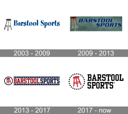
The Barstool Sports badge, used by the company in the 2000s, featured a simple black and blue composition with a black drawing of a barstool, and a bold serif lettering in blue, with a funky playful typeface and jumping letters, adding energy and motion to the badge.
2009 – 2013
The redesign of 2009 has created a bolder and more confident version of the badge, with clean contours of the elements, more distinctive shapes, and a refreshed color palette. The barstool was now drawn in brown, looking more realistic, while the inscriptionkept its blue color, but gained a new typeface and a thin white outline of the characters, which made the lettering more visible only a light greenish-blue background.
2013 – 2017
In 2013 the Barstool Sports logo was redesigned again, with a new style, and mood, created by stable distinctive shapes of the characters and a new color palette, composed of red, navy blue, and white. The new badge was composed of a red barstool emblem, placed against a white background and enclosed into a navy circular frame, followed by the uppercase logotype in a heavy geometric serif font, with the red “Barstool” and the blue “Sports” set between two solid blue lines with white five-pointed stars drawn along them.
2017 – Today
The Barstool Sports logo is composed of a graphical part, which is most often used on its own, and lettering, that is present on the official version but usually stays away. Both elements are set on a solid navy-blue background, which can sometimes be switched to transparent or black, while all other elements keep their shades.
The original navy blue version comprises a red barstool in a white outline, placed with a slight slant to the left as if it is going to fall. The barstool is enclosed into a circular frame, formed by numerous five-pointed stars in solid white. In the case of the black and white color palette, all elements remain untouched.
As for the lettering, it is set in the uppercase of a square serif typeface, which is most often associated with collegiate sports programs. Her rounded ends of the lines and their boldness makes the typeface of the Barstool Sports logotype look like Yearbook Solid or Winner Narrow Medium.


