TurboTax is a computer program, created by SoftView company for tax preparation. The software was developed in 1993 in the USA and today is the most popular program in the tax segment, having its versions for all the operational systems.
Meaning and history
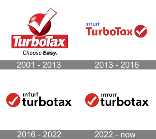
This tax preparation software is created by Michael Chipman and owned by Intuit. He worked for Chipsoft in the 80s when he created TurboTax. Intuit bought Chipsoft in 1993. This meant that they now had ownership rights to the TurboTax application. Several decades later, TurboTax has grown from a modest Californian company to a tax software giant.
What is TurboTax?
TurboTax is a renowned software company specializing in tax preparation software. Their products cater to individuals and businesses, simplifying the process of filing tax returns. Known for its user-friendly interface, TurboTax guides users through a step-by-step process, ensuring accuracy and maximizing refunds. This makes it a popular choice for those seeking an efficient tax filing solution.
2001 – 2013

The initial logo for TurboTax, created in 2001, featured a horizontally stretched red rectangular banner with the bold white logotype on it, a three-dimensional ted shorter with an enlarged white tick, placed above the banner, and a black slanted “Choose Easy” tagline, executed in two thicknesses of the letters.
2013 – 2016
The redesign of 2013 switched the color palette of the TurboTax logo to red, white and blue, and made it modern and flat. The new logotype was written in red, using a smooth contemporary sans-serif typeface for its title case letters. The solid Ted dot with a white tick on it was placed on the right from the inscription, and a delicate blue “Intuit” lettering in the lowercase was set above the logotype, on its left part.
2016 – 2022

The TurboTax logo is brief and bright, it represents the software, that professionally copes with its main task — income tax preparation.
The logo is composed of a wordmark and an emblem on its right, which is also a brand’s icon and is usually used without any logotype.
The lettering of the nameplate in the lowercase is executed in a classic sans-serif typeface, which is bold and smooth. It evokes a sense of authority and stability, as well as shows the brand as strong and progressive.
The TurboTax emblem is a bold red circle with a white tick on it. It is a celebration of software’s capability and professionalism, as well as passion and energy, which are its developing company’s characteristics.

The TurboTax logo is laconic but shows everything the client needs to know about the program — it knows what to do, and does it quickly and properly, not leaving any concerns.
The traditional color palette of the software’s visual identity represents the brand’s confidence and stability, its progressive approach and the ability to follow the constantly changing system.
2022 – Today

A hardly noticeable update was introduced in 2022. It was done along with the updated logo of the company owning this product. All the elements stayed the same except for the “Intuit” inscription. It now featured a more rounded font and no dots above the “T”. This change created a more user-friendly and flexible image of the Intuit company and its products.


