Tuborg is a Danish beer brand, founded in 1873 on a harbour in Hellerup, an area North of Copenhagen, Denmark. Since 1970 it has been part of the Carlsberg Group. Tuborg is one of the ten biggest beer brands in Europe and the fastest growing beer brand in China and India.
Meaning and history
The Tuborg logo is crispy and fresh. The brand position is based on the “Open for Fun” theme and it is being reflected in its logo.
Bright green and white combination is the core of the brand’s color palette. The white wordmark is very recognizable. For generations Tuborg beer has been associated with their Stenskriften typeface – a heavy Slab Serif in capital letters accompanied by the display font Cheltenham for lower case letters.
The logo is based on the historic logotype and the historical look and feel of the Tuborg label is still highly recognizable. The Tuborg logo highlights the “tipping point”, which is the moment at which someone takes the first sip from the bottle. Tilted at 62.5 degrees, the logo appears to be horizontal at this moment.
The name Tuborg comes from Thuesborg (“Thue’s castle”), a Copenhagen inn from the 1690s situated in the area of the brewery.
Tuborg logo has a very young look and feel, but the brand retains its successful legacy.
What is Tuborg?
Tuborg is the name of one of the beer brands owned by the famous Carlsberg Group. The brand was established in Denmark in the middle of the 1870s and became extremely popular all over the globe in the 1990s.
1995 – 2008
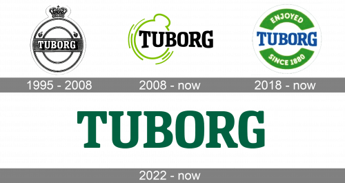
The Tuborg logo, introduced in 1995, featured a classic circular shape but with small detail, making it unique — a crown, which was drawn on top of the roundel in a very delicate size, which made the whole composition look like an old-style pocket watch. The badge was light and airy, with the logotype in all capitals written on a horizontally stretched banner, which was crossing the circle in its central line.
2008 – now
The redesign has introduced a very modern and minimalistic Tuborg badge, which we still can see today. The new concept consisted of a bold black logotype, accompanied by a stylized laconic emblem in bright green, set on the left from the lettering and rounding up the first two characters. It was a circular frame with a little appendix on top, resembling the contours of the previous Tuborg badge.
2018 – now
In 2018 the company decided to start using one more logo. It is a pretty traditional badge in a circular shape, with the bold blue Tuborg lettering written horizontally in its center, against a white background, and two arched green banners on top and bottom of the badge, with the white “Enjoyed Since 1880” inscription written over it.
2022 – now
Another version of the Tuborg logo was introduced by the brand in 2022, and it is definitely the most minimalistic badge of the brand ever created. The new concept uses only a sleek bold uppercase logotype, executed in a chic and deep shade of green, evoking a sense of quality and professionalism. The font of the new badge repeats the previous versions but has all characters cleaned up, refined, and balanced.


