Tropicana is an American brand of juices and fruit beverages manufacturer, owned by PepsiCo. The brand was established in 1947 and acquired by the world’s most famous drinks corporation in 1998.
Meaning and history
The Tropicana logo is one of those examples of the brand’s visual identities, that hasn’t changed much since they were created first. The original logo from 1947 is almost the same as the one we all know today, except for its color palette.
The first Tropicana logo was composed of a wordmark with a tagline placed on a curved ribbon under the nameplate. Executed in a custom sans-serif typeface, which is similar to Hobo D font, the inscription looked modern and strong.
The tagline was written in all capital letters of a traditional serif typeface, which added elegance and timelessness to the brand’s visual identity, as well as its monochrome palette.
Throughout the years, the color of the Tropicana logo was changed to green, then orange, and in 1998 it became green again.
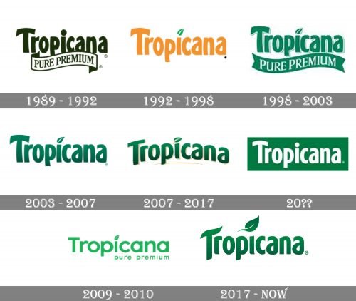
1989 – 1992
The first logo of the brand was introduced in 1989 and stayed with it for only three years. It was a simple dark green logotype in a title case, executed in a bold sans-serif typeface with the thick lines of the letters slightly arched and softened. Under the wordmark there was a white waved ribbon in a green outline, where the “Pure Premium” tagline in the uppercase of a traditional serif font was written in green.
1992 – 1998
The redesign of 1992 removed the ribbon with the tagline from the brand’s visual identity and switched the color of the logotype to orange. The dot above the lowercase “I” was replaced by a stylized green leaf, which showed the natural concept of Tropicana juices and made the palette more dynamic.
1998 – 2003
The logo, created in 1998 was based on the two previous versions. The lettering kept its typeface but changed the color to green, and the white ribbon from the original emblem was colored green and placed under the main inscription, with the “Pure Premium” tagline in white, written in a sleek and bold serif typeface. The letters of the main logo part were shadowed and outlined in white and green.
2003 – 2007
In 2003 the ribbon gets removed again, and the main logo is being refined and modernized. Though the typeface was not changed, the contouring and shadow were erased and the color of the letters’ bodies was elevated to a more intense gradient green, which looked professional and stylish.
2007 – 2017
The logotype was arched and underlined with a thin gold line in 2007. Gold was now not only in the underline, but it was a color of the letters’ contours, along with white. The leaf above the “I” was redrawn and now gained a thick gold line in its middle. This redesign made the Tropicana logo more airy and delicate.
2010 – Today
In the middle of the 2010s, the Tropicana logo was refined again. The logotype was cleaned and made a bit stricter. Its color was switched to white and now the inscription was set on a green rectangular banner. The leaf above the letter “I” was gone and not it was a simple solid white dot. Minimalist and laconic, this Tropicana logo is still in use by the brand.
2009 – 2010
In 2009 the brand decided to experiment and change its iconic typeface to something new, this lead to a light green and white badge with the full rounded shapes of the sans-serif lettering underlined by a lowercase “Pure Premium” placed on the right side of the badge, with no ribbons or frames. This version only stayed with the brand for a few months, being replaced with a more traditional logo.
2017 – Today
In 2017 Tropicana brings back its logo, created in 2003, but changed its color palette to plain muted orange, which looks very natural and warm. The leaf above the “I” is back and balances the warmth of the logo, adding freshness and harmony.
The current Tropicana logo was designed in 2017 and is still composed of a wordmark, with almost the same typeface. The only difference is in the horizontal bar of the letter “T”, which was always arched, but the latest version made it more curved and looking upright.
There is also a green leaf above the letter “I”, which first appeared on the logo version from 1992. Today it is enlarged and refined, adding individual character and style to the brand’s logo.
Font and color
The Tropicana logotype hasn’t changed much since the very first version creating in the 1980s. The thick sans-serif typeface with smooth arched lines is the signifier of the brand, and is instantly recognizable all over the globe, no matter in which color it is written. The Tropicana typeface is something in between Kandira Extra Black and Linotype Spitz Pro black, but, of course, with lines modified.
The green and orange color palette of the primary Tropicana logo is a representation of the company’s philosophy — using only natural ingredients. This color combination looks very friendly and evokes a sense of reliability and trustworthiness.


