Trivago is an online travel service, specializes in meta detach in the related fields. The company was established in Germany in 2005 and today is owned by Expedia, one of the leading travel agencies in the world.
Meaning and history
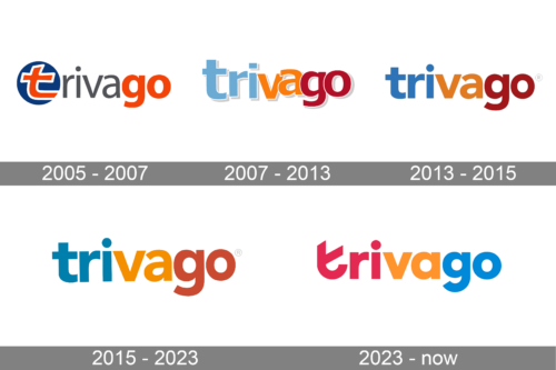
The Trivago visual identity has always been text-based and very simple, though the laconic approach to composition was compensated by a bright color palette, con-sisting of three bright shades.
What is Trivago?
Trivago is the online travel-service, which was established in Germany in 2005, and specialized in providing information on hotels, being the first search-engine in hospitality in its country. Today Trivago, based in Düsseldorf, is available in almost 200 countries across the globe.
2005 – 2007
The original logo for Trivago was created in 2005. It was a wordmark in the lower-case with the letter “T” stylized and placed inside a solid blue circle. The orange “T” outlines in white were the brightest sport of all the insignia and were followed by a strict and modest “Riva” in a dark gray sans-serif, and a bold orange “Go”.
2007 – 2013
The redesign of 2007 removed the circular element from the logo and made the whole inscription executed in one style, but still three different colors. The jumping and overlapping letters of the wordmark were still written in the lowercase but feature a bold and modern sans-serif typeface, a white outline, and a light gray shadow. The colors for “tri”-“va”-“go” were light blue, yellow, and red respectively.
2013 – 2015
The logo is a graphical representation of the brand “trivago,” which is widely recognized in the travel industry for its hotel search and comparison services. The logo features a unique design with the company name in lowercase letters. The “t” is colored in blue, symbolizing trust, reliability, and professionalism, which are core values of the company. The rest of the letters are in bold red, conveying passion and energy. The “i” is dotted with a blue circle, perhaps indicating the global reach of the company and its focus on the international market. The font is modern and sans-serif, which gives the design a clean, accessible feel, inviting users to trust the company for their travel needs.
2015 – 2023
The color palette was kept, but the wordmark got redesigned in 2013. The lettering is now set in one line, which looks more solid and professional. The wordmark is executed in a bold sans-serif with smooth clean lines and not much space between the letters. All the shades have been elevated and became a bit darker and sleeker.
The current Trivago logo is the most minimalist of all versions, yet is looks confident and reflects the purpose of the company — to open new horizons to its customers and to show them the world full of different wonders and emotions.
2023 – Today
Thank you for clarifying the color scheme of the Trivago logo. The logo is indeed composed of the word “trivago” segmented by different colors which are used to distinguish parts of the name. The first segment “tri” is in red, a color that is often associated with excitement and passion, reflecting the dynamic nature of the travel industry and the vibrant experiences the company seeks to provide.
The next segment “va” is in orange, which is a color that can represent enthusiasm, creativity, and affordability. This could imply that Trivago offers inventive and cost-effective solutions for travelers.
The final segment “go” is in a light blue, which typically symbolizes tranquility, reliability, and trust. This part of the logo might suggest that the company’s service is reliable and easy, assuring potential customers of a stress-free experience when using Trivago to plan their travels.
The use of these colors in the logo not only makes it visually striking but also conveys the brand’s attributes and the qualities it wishes to communicate to its customers. The font style is modern and sans-serif, which contributes to the logo’s clean and user-friendly appearance, indicative of Trivago’s emphasis on simplicity and ease of use in its service.
Font and color
The bold lowercase Trivago logotype from the primary logo of the company is set in a modern sans-serif typeface, with stable letters featuring classic shapes and straight cuts. The closest font to the one used in this badge is Avenir Pro 95 Black.
As for the color palette of the Trivago visual identity, it is composed of a calm blue, intense orange, and dark red. These three shades create a very confident and solid image, representing the company as a professional, passionate and trustworthy one.
Corporate logo
The Trivago corporate logo is slightly different from the online platform’s badge, although uses the same typeface for the lowercase logotype, which is set under a bright abstract emblem. The inscription on the corporate insignia is usually executed in dark gray, but can also be seen in black.
As for the graphical part of the logo, it is drawn in the color palette, repeating the Trivago insignia, blue, orange, and red. The emblem looks like a ring with its contour opened in the top part, and the ends soft and rounded. The ring is drawn with a slight turn, which adds a sense of motion and volume to the simple shapes of the elements.


