Tramontina is a manufacturer of cookware, cutlery, and home appliances. It is headquartered in the city of Carlos Barbosa, Brazil.
Meaning and history
In its motherland, Tramontina is not a simple company, but a legend, which made Brazilian production popular all over the globe. The history of the company begins in 1911 when Valentin Tramontina opened a small blacksmith store in the Rio Grande does Sul in southern Brazil.
After the founder died in 1939, the company was taken over by his wife, Elisa, who began to work hard to improve the quality of the products produced and improve production standards. Ten years later, Valentin and Elisa’s son Ivo and his partner Roy Skomazzon take over the company.
The modern era of the company began in 1954 when it began operating under the Tramontina brand, the name Tramontina has become synonymous with quality, fair pricing, reliability, and great style.
Tramontina is now one of the world’s largest manufacturers of household goods, ranging from kitchen utensils and cutlery to Teflon-coated cookware. Over 18 thousand different products distributed in more than 11 distribution centers are available to customers in more than 120 countries.
But the most famous products of the brand are the knives. Currently, Tramontina is one of the largest knife manufacturers in the world, producing two million knives per day. All of the brand’s knives are made in Brazil. Thanks to modern production and low labor costs, the company maintains a reasonable price for its products all over the world. And provides working places for thousands of Brazilians.
What is Tramontina?
Tramontina is the name of a Brazilian manufacturer of cutlery and kitchen appliances, which was established in 1911 and named after its founder, Valentin Tramontina. Today the company distributes its products all over the globe, having its offices in different countries.
1911
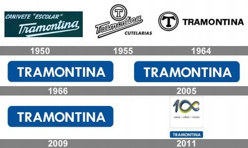
The brand was started in 1911 by Valentin Tramontina. The earliest Tramontina logo featured the handwritten name of the marque. It had several versions.
1955
The most popular logo of this period featured the name of the brand “written by hand” and directed upwards. The lower end of the final “a” was extended and formed an underline below the word. You could also see the lettering “Cutelarias” explaining what kind of goods the company produced. This word was given in a more generic sans serif type.
Since the “handwritten” logo was hard to make uniform and reproduce, an additional emblem was adopted. On it, you could also see a roundel housing the capital letter “T.”
1964
The problem of a uniform logo was resolved by introducing a completely different design. This time, the name of the brand featured a plain sans. It lost much of its elegance, yet was better legible than its predecessor. This was partly because the glyphs were solid black.
The capital “T,” on the contrary, adopted a more artistic shape.
1966
The redesign of 1966 introduced a clean and professional badge with the white uppercase lettering in a bold and neat sans-serif typeface, placed on a horizontally stretched banner in a calm blue color. The combination of colors and the strictness of the lines made the whole logo look confident and stable, representing the company as a reliable and trustworthy one.
2005
The current wordmark is inspired by its predecessor – you can see it from these minimalist, unobtrusive glyphs. They have been slightly modified, to make the wordmark look lighter: the ends of the “t” have been cut, the vertical bars of the “M” have been replaced by diagonal ones, etc.
2009
The most notable part, however, has been the addition of the blue square with rounded corners. The colorful background helps to make the Tramontina logo recognizable.
2011
For the 100th anniversary of the company, the new badge was designed in 2011. The corporate horizontal banner with white lettering could be seen in its iconic blue and white palette, or a new gray and white scheme, and was placed under a square graphical badge with the gray, green and blue “100” inscription, where the zeroes were stylized as an infinity size, and an additional sans-serif lettering “Years” in all caps, and “1911 — 2011” dates on the bottom.
Font and Color
The clean and fresh lettering from the Tramontina primary logo is set in a medium-weight sans-serif typeface with distinctive geometric contours of the uppercase characters. The closest fonts to the one, used in this insignia, are, probably, SF Droob7, Verdana Pro, or Meiryo UI, with almost no modifications.
As for the color palette of the Tramontina visual identity, it is based on a deep shade of blue with white elements, which looks very professional and trustworthy, evoking a sense of stability, reliability, and confidence.


