Candy is a European brand of major household appliance manufacturer. The company, which was established in 1945, is the pioneer on the Italian washing machines market. Today Candy operates all over the globe and is one of the leaders in its segment.
Meaning and history
The Candy logo is light, vivid and playful. It’s custom italicized typeface is simple and elegant and looks friendly due to its form and light blue color palette.
Candy is known for its washing machines, and the first color associated with its industry segment is blue. The clean and fresh color reflects the brand’s products quality and technologies.
The bright blue letters are shadowed, which give a 3D effect to the nameplate, especially when it is placed on a white background.
Candy became synonymous to washing machines in Europe, and its logo is highly recognizable across many countries.
Candy was named after a popular song of the 1940s, which was later covered by Nat King Cole.
Font and color
The main element of the Candy logo is, of course, its color. The bright sky-blue shade makes the thick and massive letters of the uppercase italicized logotype look lighter and more delicate.
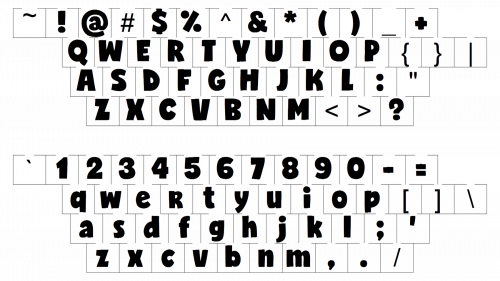
The Candy wordmark is executed in a custom typeface, with the large letters slanted and softened. The first three letters are also connected to each other, white the last two are set on a small space in between them. The custom font of the Candy lettering is probably based on one of the following typefaces: Sequel 100 Wide 96, Benzin Extra Bold, or Rifton Italic.
The bright blue on white, the Candy color palette, stands for lightness, easiness, and loyalty of the brand. It is also instantly associated with cleanliness, which makes sense, as Candy is mostly known as the washing machine brand.


