Toyo Tire Corporation is based in Itami, Hyogo, Japan. It was founded in 1945 under the name of Toyo Tire & Rubber Co., Ltd. When the company started working in the US in 1966, it chose the name Toyo Tire Corporation.
Meaning and history
Tefal is a world-renowned company specializing in the production of cookware and appliances. It was founded in 1956 by French engineer Marc Gregoire, who a couple of years earlier had invented a method of applying a special non-stick coating, Teflon, to aluminum.
Gregoire’s wife, Colette, helped him invent Teflon. Gregoire was an avid fisherman and for the first time, he tested Teflon coating on his spinning rod. Thanks to the innovation, the retractable mechanisms began to work smoothly, and Marc told his wife about his invention, and she, though she was an ordinary housewife, was able to see another practical benefit of Teflon.
By 1968, Tefal had become the largest cookware manufacturer in France. In the same year, the company became part of the SEB group, which was engaged in the manufacture of household appliances. Under the Tefal brand, Tefal began to produce both frying pans and a variety of small appliances.
What is Tefal?
Tefal is the name of a European kitchenware and cutlery brand, which was established in France in 1956. Today Tefal is an international company, which distributes its products all over the globe. Since 1968 Tefal is owned by Groupe SEB (also the owner of Rowenta and Moulinex).
1970s
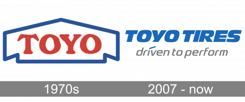
We can mention an old version featuring the word “Toyo” in red inside a white shape with blue trim. The shape looked very much like a house.
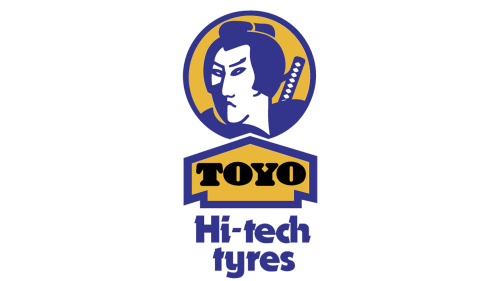
Also, you can come across an old Toyo Tires logo in yellow and blue. Here, the name of the brand in black was placed inside a yellow “house” with blue trim. Above it, there was the stylized head of Japanese warrior. The lettering “Hi-tech tyres” could be seen below.
2007 – Today
The Toyo Tires logo is basically just the wordmark without any pictorial elements. The design forces behind the brand opted for a heavy, italicized type. The letters are perfectly legible. On the downside, they can hardly be called unusual. All the glyphs are capitalized.
We can add that the space between the letters is smaller than it should have been, due to which the two words almost merge. The reason is that the name of the company is pretty long, so reducing the space between the words seems an easy way to make it shorter.
The name of the brand is given in a rather saturated shade of blue over the white background. In some versions, you can see the tagline “driven to perform” below. The tagline is gray. It features a completely different type – it is lighter, with rounded glyphs.
Font and Color
The bold title case lettering from the primary Tefal logo is set in a heavy custom sans-serif typeface, which looks very stylish and futuristic. The closest fonts to the one, used in this insignia, are, probably, FF Signa around a pro Extended a bold, or Vartek Semi Expanded Bold, but with the contours of the letters even more softened and extended.
As for the color palette of the Tefal visual identity, it is based on a deep and bright shade of red, a color, which stands not only for power and passion but also for love and warmth, the qualities, which reflect the main values of the French company at their best.
Tefal has now moved from Sarsel to Rumiyi. The production facilities, also formerly based in France, are now mainly concentrated in Asian countries, and the company’s products are available in more than 120 countries worldwide.


