Total is a petroleum company, established in 1924 in France, one of the world’s leaders in the industry, and a part of the “Supermajor” list of energy corporations.
Meaning and history
The visual identity of the famous fuel company has undergone several major redesigns throughout the years and turned into a stylish and modern logo, which could easily be pictured as an emblem of a mass-market cosmetics or sports brand.
What is Total?
Total is the name of a French petroleum company, which was founded in the middle of the 1920s. Today Total Energies is one of the world’s top 7 oil players, operating globally, and having a revenue of almost 185 billion USD.
1954 – 1955
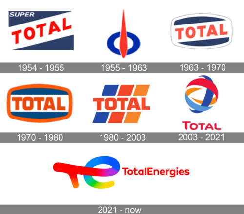
The original Total logo was introduced in 1954 and featured a simple yet bright design, where the dark blue rectangle had a wide white diagonal banner crossing it from the bottom left to the top right corner. On the white background, there was a bold red “Total” inscription in all capitals of a slightly narrowed Sans-serif typeface.
1955 – 1963
The logo, created for the brand in 1954 was something completely different and extremely stylish. It was an abstract geometric badge, composed of a solid blue ring, crossed by a thick vertical red line with its peak sharpened. The image resembled a fuel indicator.
1963 – 1970
In 1963 the emblem from 1954 came back to the brand, but with the refined lines and a new white frame with its horizontal sides arched from the center, and verticals — straight. The lettering on the logo was slightly modified and its color switched to a lighter shade.
1970 – 1980
In 1970 the frame of the emblem turned red and the diagonally located banner became horizontal, with the wordmark executed in bolder lines, and the edges of the letters touching each other. The color palette of the emblem became darker and more intense.
1980 – 2003
The redesign of 1980 changes the composition of the logo to a more modern one. Now the “Total” lettering was placed on a background, composed of three wide diagonally printed lines in blue, red, and orange. The red inscription was set on a white horizontal line, which made the whole look more contrasting and bright. The typeface of the wordmark repeated the one from the previous version.
2003 – 2021
In 2003 the logo of Total was completely redesigned. The new stylish insignia featured a circular multicolor emblem placed above the red Sans-serif lettering in a title case. The graphical part of the logo depicts a flat sphere formed by several ribbons on orange, blue, and red.
2021 – Today
With the redesign of 20211 the logo of Total became brighter and more ornate, even though sometimes the company uses just the wordmark. The official logo is composed of a lm abstract colorful emblem, with the stylized handwritten “TE” monogram in gradient rainbow palette, followed by a bold title case inscription in a rounded sans-serif, with all characters set in plain red color.
Font and color
The Total lettering from the logo, designed in 2003, is executed in a custom modern Sans-serif typeface with smooth contours of the capital letters. The first “T” is enlarged, to add a more professional look to the logo. The Total font looks pretty similar to classic shapes of Artegra Sans Extended SC ExtraBold, with with the rounded angles and arched bars of the “A”.
The bright and vivid color palette of the Total visual identity reflects the diversity, power, and passion of the brands pointing to such qualities as reliability, progressiveness, and confidence. The main color of the emblem is red, and it stands for fuel, energy, and growth.


