The visual identity of a rock band often becomes as iconic as its music, with logos acting as the visual soundtrack to the band’s ethos and legacy. These symbols, crafted with meticulous detail, capture the spirit, attitude, and essence of the music, becoming immortalized in the minds of fans and on the merchandise that adorns them. From t-shirts and posters to album covers and beyond, a band’s logo is more than just branding; it is a badge of honor for fans, a symbol of allegiance to the tribe of followers that share a common musical journey.
The genesis of these logos often reflects the cultural, political, and social undercurrents of their times. The 1960s and 70s, for instance, birthed logos that were heavily influenced by the psychedelic art movement, reflecting the era’s call for peace, love, and rebellion against the status quo. These logos, with their vibrant colors and surreal imagery, encapsulated the spirit of an era where music was a vehicle for change. Bands like Grateful Dead and Pink Floyd used their logos to communicate a sense of community and otherworldliness, inviting fans into a shared, immersive experience that went beyond the music.
As we moved into the 80s and 90s, the logos evolved to mirror the changing soundscapes of rock music. The emergence of punk brought raw, edgy logos that defied traditional design norms, symbolizing the rebellious heart of punk music. Meanwhile, the rise of metal saw logos that embraced darker, more Gothic elements, reflecting the genre’s intense and powerful sound. These logos were not just identifiers but declarations of the band’s musical and ideological standpoints, etched in bold, uncompromising strokes.
In the digital age, the creation and dissemination of band logos have transformed, leveraging the global reach of the internet to create symbols that resonate across diverse cultural landscapes. Today’s logos are more than just visual art; they are interactive experiences, often designed to engage fans in a multimedia dialogue. This evolution reflects the changing nature of music consumption and fan interaction, where logos must not only capture the essence of the band’s music but also its presence in a digitally connected world.
Each logo, with its unique design and historical context, tells a story of artistic innovation, cultural shifts, and the enduring power of music to unite people. As we explore the most popular rock bands’ logos and brands, we delve into a rich visual history that parallels the evolution of rock music itself, showcasing how these symbols have shaped and been shaped by the ever-changing landscape of popular culture.
10. ABBA

ABBA logo consists of letters only, but complies with all demands of successful logos – it’s symmetric, informative, easy to remember, and bears a certain image. It was enough just to mirror one letter – and a recognizable logo is ready.
9. AC/DC
AC/DC logo was created in 1973 and is still relevant. It has become the most recognizable sign of the band. The gothic style font with letters divided by a lightning is pretty simple and reserved. That makes it easy to read and at the same time suitable for use in printed and outdoor advertisements.
8. Pink Floyd
Pink Floyd logo manifests the influence of graffiti street culture. No strict horizontal or vertical line – all of them are crooked, deformed. Besides, the bright pink color only highlights the remonstrative character of the band. Anyway, this composition looks harmonically and well-ordered. The ‘K’ curl looks appealing.
7. The Rolling Stones

The Rolling Stones logotype has a provoking and bright image and the same font. The font is close is handwritten one, and it’s clear that it has the secondary role. A gripping three-colored picture (black, white, red) expresses the rebellious image of the band.
Besides Rolling Stones logo was created in the 1970’s and is still used today, which is a rare occasion.
6. U2

U2 band logotype is both original and memorable. The name is very brutal, but this font is both highlighted and compensated by the red words naming the tour. The logo is framed in a very peculiar way. At the first glance, it looks like a target, but the ‘fins’ at both sides remind of a shark or other predator. Therefore, the logotype structure is full of different symbols that are individual for every viewer.
5. Led Zeppelin
Both band name (paradoxical “Led Zeppelin”) and its logo represent a specific font element which makes it one of Top-5 best logos. Formally, the logotype is symmetrical (PP as the logo center) and rhythmical. However, this rhythm bears the character Led Zeppelin – it’s chaotic, non-homogeneous. Every letter has its own width and height, although the form of logo seems to be strictly rectangular.
4. Metallica
The logo of Metallica matches its music. Dynamic and sharp, it shows people what their songs will be like even before people start listening to them. However, today Metallica logotype looks less original. It’s symmetric and the central part isn’t adorned, and the first and the last letters are turned into arrows.
3. The Beatles

The Beatles logo has several signs in it. It’s symmetric (prolonged T letter highlights this symmetry) and at the same time original (the capital letter is located in the left part only), contains both font and images (though they can be easily removed), and is easy to remember.
2. Aerosmith
Aerosmith logo was created in the 1970’s, and it combined a light font with rebellious elements typical of the band’s art, as well as the disc with wings. The image is very interesting thanks to the aeronautic signs with philosophical and even esoteric senses.
1. Queen
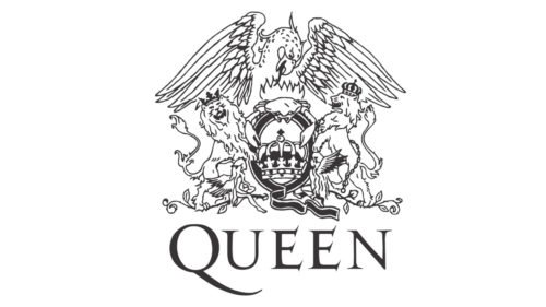
Queen logo is aristocratic – the name supposes it. However, if you take a closer look at the image, its heraldic elements have a lot of informal signs. The logotype has a crown – it’s located in the oval form (it reminds of a shield, which is essential for a coat of arms). However, it’s not just an oval – it’s the ‘Q’ letter.
The crown is held by two crowned lions, one of which is depicted sidewise, and another – full face (which is not typical, and even inadmissible for armory). On the top of the arms, we can see a bird of prey that spreads its wings. If you continue looking, you’ll see other creatures – a crab and two angels. The logo legend says that this image hides astrological signs of the band members.
Logotypes of rock bands differ just like the bands themselves. Some logos were changed during decades of their existence, while others are still used today as trademarks of musical product – famous rock groups.
Conclusion
In exploring the rich tapestry of rock music’s visual culture, we have traversed the iconic landscapes of band logos, symbols that are not merely markers of identity but gateways to the soul of the music itself. The lips and tongue of the Rolling Stones, conceptualized by Mick Jagger and inspired by the goddess Kali, stand as a testament to the rebellious spirit and raw energy of rock. This lips logo, with its evocative typography, has become as legendary as the music, symbolizing the essence of rock’s audacity.
The logo design of Nirvana, featuring a smiley face adorned with a lightning bolt, encapsulates the angst and rebellion of a generation. It’s a stark reminder of how a rock band’s logo can transcend the band’s name, embedding itself in the cultural lexicon. Similarly, the typeface and imagery of The Beatles, with the unique drop-T logo design created by Ringo Starr, reflect the innovative spirit of the band, from Liverpool to London, and beyond.
Daft Punk, though primarily known for their contributions to electronic music, brought a rock sensibility to their visual presentation. The duo’s use of futuristic helmets and typography on album covers echoes the transformative power of imagery in music. Their aesthetic, much like the skulls and lightning bolts found in traditional rock imagery, challenges conventions and inspires fans. For the Grateful Dead, their emblematic logo design—a marching bear and a skull adorned with a lightning bolt, encapsulates the essence of their psychedelic sound and the communal spirit of their fans, embodying a unique blend of Americana and improvisational music that continues to resonate across the world.
The American band Kiss took the visual aspect of rock to new heights with their logo design, incorporating lightning bolt-like S’s, and their faces painted in skulls and crossbones, becoming icons of the genre. Their drum kit, often emblazoned with the band’s name and bass drum featuring the unmistakable logo, reinforced their brand at every concert.
Queen, led by the charismatic Freddie Mercury, utilized the zodiac signs of all four members to create their emblem, showcasing the typography and musicians’ personalities in a unique blend that resonated with a diverse audience. This logo design reflects the theatrical and eclectic style of their music, immortalized on album covers and T-shirts worn by fans worldwide.
In conclusion, the evolution of rock band logos reveals a fascinating interplay between visual art and music. From the pop-infused duo of Daft Punk to the American band’s theatrics, each logo design serves as a visual shorthand for the band’s identity, while the typeface used in their names becomes synonymous with their sound. Whether it’s the bold typography of Nirvana’s smiley face or the lips and tongue of the Rolling Stones, these symbols have etched themselves into the fabric of pop culture. They remind us that the power of a band’s logo, much like its music, lies in its ability to evoke emotion, tell a story, and connect with fans across generations.


