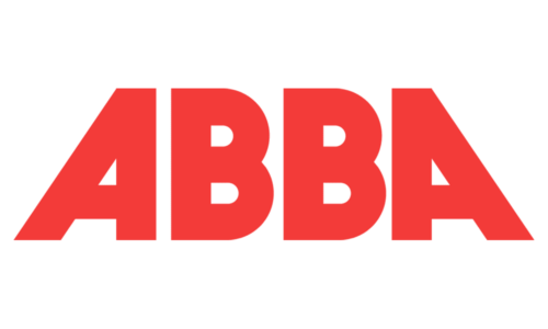
ABBA is a Swedish pop supergroup created in Stockholm in 1972. Each of the letters of the group’s name represents the initial of the name of one of the members. The two “A’s” stand for Agnetha Fältskog and Anni-Frid Lyngstad, while the two “B’s” stand for Björn Ulvaeus and Benny Andersson.
Meaning and history
The ABBA logo is one of the well-known examples of so-called ambigram (a design that may have several interpretations as written). Due to the fact that the first “B” is, technically speaking, not a “B” but its mirror reflection, the simple wordmark gets an original touch. The white gap between the two pairs of letters creates a symmetry axis. In other words, the pairs look like a mirror reflection of each other.
The iconic ambigram was unveiled on the French compilation album, Golden Double Album, released in the spring of 1976 by Disques Vogue.
The backward “B” logo was created by Rune Söderqvist, a graphic artist who had worked in the advertising business and had his design studio.
According to the band’s official website, the idea to use such a letter also belonged to Rune. He supposed that each “B” (Björn and Benny) should face one of the “A’s” (Agnetha and Anni-Frid) to reflect the fact that these people were two couples. By the way, Rune, who began collaborating with the band in 1975, went on to create every subsequent album sleeve. He has been known as the author of the majority of their record sleeves.
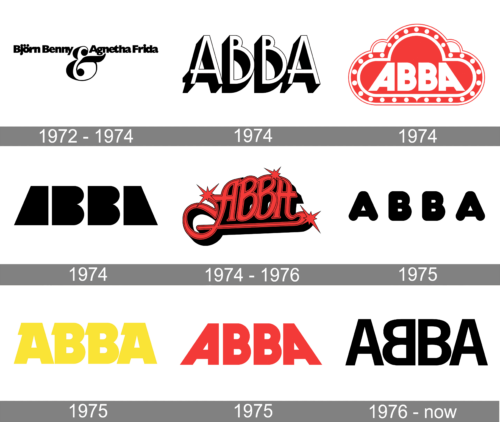
1972 – 1974
1974
1974
1974
1974 – 1976
1975
1975
1975
1976 – Today

While the official website names Söderqvist the author of the ambigram idea, other sources tell us a different story. They claim it was the idea of the German photographer Wolfgang “Bubi” Heilemann. During a velvet jumpsuit photoshoot for the Bravo magazine, each musician was shot with a giant initial letter of their names. The legend has it that it was only after the photoshoot that Heilemann noticed that Andersson reversed his “B” glyph.
Heilemann suggested that they leave the letter as it was, and the musicians agreed to it. Eventually, they liked it so much that this version became their registered trademark.
When PolyGram purchased the band’s catalog, experiments with the ABBA logo started. First, there was some playing around with the types. In 1992, a crown appeared on the emblem.
However, when PolyGram was acquired by Universal Music and the control of the brand identity returned to the capital of Sweden, the original logo reappeared on all official products.


