The band was not afraid to experiment with music, visual arts, and messages of continuous personal development. These efforts eventually propelled the band to worldwide fame and success. At the same time, if Tool’s music can be understood by knowing how the music laws work, the lyrics are more complicated. On the one hand, they are very personal. On the other, most songs are extremely mysterious and mystical. There are so many possible interpretations that fans have been arguing about the meaning of some songs for decades.
Meaning and History
The band was born in Los Angeles in 1990 when Danny and Paul met Adam and Maynard. The band created many tracks still loved by its fans and released eight videos, seven of which were directed by the band’s guitarist Adam Jones. In 2019, Tool came to Spotify and Apple Music, after which everything changed: all five of the band’s releases hit the iTunes top 10. Tool’s songs have taken the entire top 10 on the Billboard rock chart – something no other band in history has managed to do.
What is Tool?
Tool is an American alternative metal band, which has become one of the recognized progressive rock bands. It earned four Grammy Awards, had several world tours, and produced albums that have topped the charts in several countries.
1991 – 1992
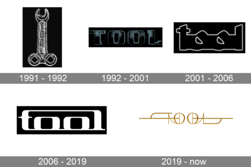
An emblem used for the EP demo album cannot be called very creative. It had a drawing of an actual wrench tool. The tool appeared to be metallic and was placed on a black background. The name of the band was engraved along the length of the tool. It featured all uppercase, sans-serif letters.
1992 – 2001
This version looks mystical and dreamy and seems to be a perfect fit for the Opiate album. The logo also has a black backdrop and even the letters are black. To make them stand out, the designers added a light blue outline and the illusion of smoke. The letters had slab serifs, a rock texture, and a three-dimensional appearance, which gave the logo a stylish touch.
2001 – 2006
The new logo also has a lot of mystery about it. The black letters stand out on the black background only thanks to the white gradient outline. Since all the letters are joined, the inscription reminds of a cemetery at night and has quite a gloomy look. One might also argue that it resembles a mask with the “O”s being cuts for the eyes.
2006 – 2019
Although the letters are connected in this logo similarly to the previous version, the letters are easier to see. They are now white and have a clean, well-defined contour. The new font has round, smooth forms but still features serifs and all lowercase letters. The band continued to use black for the backdrop.
2019 – Today
This version looks nothing like the band had previously and has a very futuristic and stylish appearance. The letters seem to be made from golden metal and have a three-dimensional feel. Moreover, the inscription is written in a very symmetrical way, so the letters “t” and “l” are horizontal mirror images of each other. Combined with the “O”s, they look like musical instruments.
Font and Color
The logos and fonts used in them evolved along with the music played by the band. Initially, these were bold, serif or sans-serif, all-uppercase letters. Then, they were replaced by lowercase inscriptions that had all the letters interconnected. The latest logo features a custom, very artistic, and stylish font that does not even look like a font but a piece of art. For most of its history, the band used a black background to create a feeling of mystery, darkness, and sophistication. The lettering was typically done in a neutral, light color. In 2019, it introduced a golden color, which looked elegant and futuristic.


