Taylor Swift is a famous American singer, who was born in 1989 in Pennsylvania. Taylor is extremely popular across the globe not only as a singer but also as a songwriter. By today she has released seven albums and earned several prestigious music awards.
Meaning and history
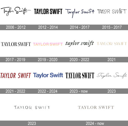
Throughout the singer’s career, there have been numerous logos created, but all of them were composed of only a wordmark, which was executed in a new style and color palette after each redesign. Taylor Swift is the name, which is known all over the globe, so no matter how it is written, it’s instantly recognizable in every corner of the world.
Who is Taylor Swift?
Taylor Swift is one of the most famous American pop singers, she was born in Pennsylvania in 1989 and became popular after the release of her first album in 2006. The name of the album was “Taylor Swift”, and the singer was only 16 when recorded it.
2006 – 2012
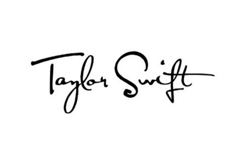
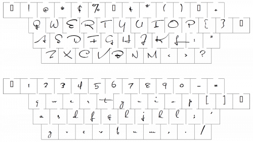
The initial logo, designed in 2006, was the most long-lasting one and stayed with the singer for six years. It was a black script logotype with wide curved tails of the letters and unique lines of “S” and “F”. Usually placed on a white background, it looked simple yet chic and classy, and made the pop-stars brand memorable.
2012 – 2014

The redesign of 2012 showed the new Taylor Swift to the world — her logo was now executed in all capital letters of a modern bold geometric sans-serif with sleek and distinct lines. The slightly narrowed inscription was perfectly balanced and kept the monochrome color scheme of the initial version, yet looked brighter, stronger, and much more confident.
2014 – 2017
The redesign of 2014 introduced another version of a handwritten Taylor Swift logotype. In was a bold dark gray inscription in a title case, with all letters, rounded, and the ends of the bars softened. The uneven texture of the lines made the whole wordmark look as if it was written with a crayon, and this created a cool and contemporary look. This simple yet very friendly and stable insignia stayed with the young singer for almost three years.
2015 – 2017
In 2014 the handwritten gray inscription replaced three main logos. It was a singer’s signature executed in a felt-tip pen style, which also had its shortened version — the “T.S.” Initials with two bold dots. Stylish, modern, and simple, it is a perfect combination that can brilliantly accompany any background and cover.
2017 – 2019

Taylor Swift comes back to traditional design in 2017 when the logotype is executed in an elegant serif font with curved clean lines and thin elongated serifs. All capital letters of the inscription are drawn in black, which allows placing it on almost any background without losing its style and sophistication.
2019 – 2020

The first light and bright logo for Taylor Swift was created in 2019 and are completely different from all the previous designs. It is still a single logotype without any additional details or graphical elements and framing. But now it’s all about the color. A light and fresh gradient from yellow in the bottom to pink on the top, makes the image look unique and crispy.
2020 – 2022
The sans-serif typeface with its strict and straight contours looks great in bold capitals of the inscription.
2021
The logo is elegant and uses a serif font with letters that have thin and thick contrasts. The color scheme is a sophisticated gold on a black background, which gives it a classic and timeless feel.
2021 – 2022
The 2021 name style changed to tall burgundy letters. These were purely capital letter, tilted slightly to the side. The font used here was one of the regular sans-serifs.
2022 – 2024
The redesign of 2022 has introduced a super simple and clean version of the Taylor Swift logo, with the name of the songs written in the title case in a calm shade of blue, against a white background. The simple shapes of the sand-serif lettering (look pretty close to such fonts as Neue Haas Grotesque Display 65 Medium and Nimbus Sans D Bold) create a very tender and kind composition, which looks friendly yet professional and stylish.
2023 – Today
The logo features the artist’s name in a serif font that is more traditional and perhaps indicative of a more classical theme. The bold black letters against a white background create a strong visual impact.
2023
This logo is minimalist and completely black, creating a stark contrast against a plain background. The font is sans-serif, which gives it a modern and clean look.
2023
This logo has a distressed and textured appearance, giving it an edgy and raw feel. This could suggest a more personal or intimate phase of the artist’s work. The font is irregular, almost as if it was hand-written with a brush or marker, which adds to the informal and unique character of this design.
2024 – Today
The logo appears to be a text-based logo consisting of the name “TAYLOR SWIFT” in all capital letters. The font is elegant, with a serif style that suggests a blend of sophistication and modernity. The letters are rendered with a metallic texture and shine, giving the logo a polished, premium look. There’s a sense of dimensionality to the lettering due to the shading and highlights, which imply a three-dimensional effect. The overall design is simple yet impactful, relying on the strength of the name itself and the luxurious styling of the font to convey its message.
Font and color
The voluminous shadowed lettering from the official Taylor Swift logo is set in a narrowed sans-serif typeface with tall italicized letters. The closest font to the one, used in the Taylor Swift insignia is, probably, Futura Now Headline Condensed Medium Italic, or Akwe Pro Con SC Medium Italic.
As for the color palette of the Taylor Swift visual identity, it uses a dark and intense hue of burgundy, a timeless and sophisticated shade, which stands for excellence and professionalism.


