 Family Home Entertainment Logo PNG
Family Home Entertainment was a home video brand based in the US. The company was founded in 1981 by Noel C. Bloom. It was a division of Artisan Entertainment and Lionsgate Home Entertainment.
Meaning and history
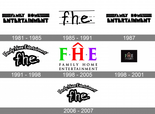
While the latest Family Home Entertainment logo looked cute, some of the older ones were somewhat scary.
1981 – 1985, 1987
The original emblem featured the name of the brand in a type called Baby Teeth due to its peculiar shape. For instance, if you take a look at the “E,” you will notice that the three bars remind the teeth of a baby: one of them can be already rather long; another one is still growing, while the third one has just appeared.
We can also add that, although this type is unusual (which is not a bad thing), the wordmark is not very legible. It looks dated and heavy. The legibility problem grows even worse since the letters are pink and neon green on the dark background (this does not create enough contrast and only blurs the writing).
1985 – 1991
The centerpiece of the design is the abbreviation “f. h. e.” It looks as if it has been written by hand in a copy-book (like those used at school to practice writing). The “school” effect is only reinforced by the fact that the letters are very uneven – they must have been written by a child.
Another addition to the “child” theme is the fact that the glyphs are lowercased, which contradicts grammar rules. The dots after each of the letters are “dancing,” too.
By the way, this logo existed in more than one version, where the shape of the letters and the hues slightly varied.
1991 – 1998
In a way, this was a modification of the previous version. While the “handwritten” letters stayed, the copy-book background disappeared (only a small stroke near the “e” reminded of it).
The full name of the brand moved above the abbreviation. It now better merged with it because of the irregular type and the arched shape.
1998 – 2005
The era of the “roof” logo started. The red “roof” above the “h” echoes the word “home” in the company name, as well as the way the company saw its specialization. In this version, you can see the “FHE” abbreviation in capitals (green, red, and violet, respectively).
1998 – 2001
The full name of the brand below is set in a light serif type with plenty of space between the letters.
2006 – 2007
While there was some playing around with the colors and the shades, the background and the details, the overall look of the Family Home Entertainment logo did not change that much.


