

![]() Tidal Logo PNG
Tidal Logo PNG
Tidal is a music, podcast and video streaming service. It was developed by Square Inc. and launched by Aspiro (Norway) in 2014. Today, the brand belongs to Project Panther Bidco. According to the brand, the number of tracks available exceeds 70 million, and there are also more than 250 thousand music videos.
Meaning and history
The Tidal logo may seem simple, yet it can’t be called minimalist. If you compare the emblem and the wordmark searching for some kind of visual rhyme, you’ll hardly reach your aim.
What is Tidal
Tidal, which has been known as Jay-Z’s streaming service, has been often criticized for its high cost. In addition to music, it offers podcasts and videos. It is a subscription-based service and provides two types of subscription: Tidal Premium and Tidal HiFi. According to the brand, it offers music artists and songwriters higher royalties than any other competing music streaming platform.
2014 – present
![]()
Norwegian company Aspiro, which branched off from the music streaming service WiMP, introduced Tidal in the United Kingdom, the United States, and Canada in the fall of 2014. In early 2015, residents of five more countries in Europe also had a chance to join the project. Now, it’s available in over 60 countries globally and can be used via various platforms.
The logo lockup includes two elements, a rather distinctive geometric emblem and an unpretentious wordmark. This approach is rather popular in logo design: when the authors of the logo want to emphasize the pictorial part, they opt for a simpler typeface.
Let’s start from the most characteristic element of the lockup, the emblem. Its overall shape leaves no doubt that this is the letter “T,” which is the initial of the name of the brand. However, that’s not a generic glyph but the result of a fastidious work of a designer.
The “T” is made up of four identical squares. They might look like rhombuses, at first glance, but in fact these are squares. The design bears an uncanny similarity to a slightly reduces taxi logo, with the exception of the position of the elements. Here, each square is standing on one of its angles.
The position of the elements is pivotal in terms of the psychological effect of the Tidal logo. Most often, four-sided shapes are used as a visual representation of stability, trust, equality, and security. Additionally, shapes with right angles represent order, rationality, and formality. And yet, the moment a tilt is introduced, all the “stability” and “order” ideas vanish. Instead, the shapes become more eye-catching.
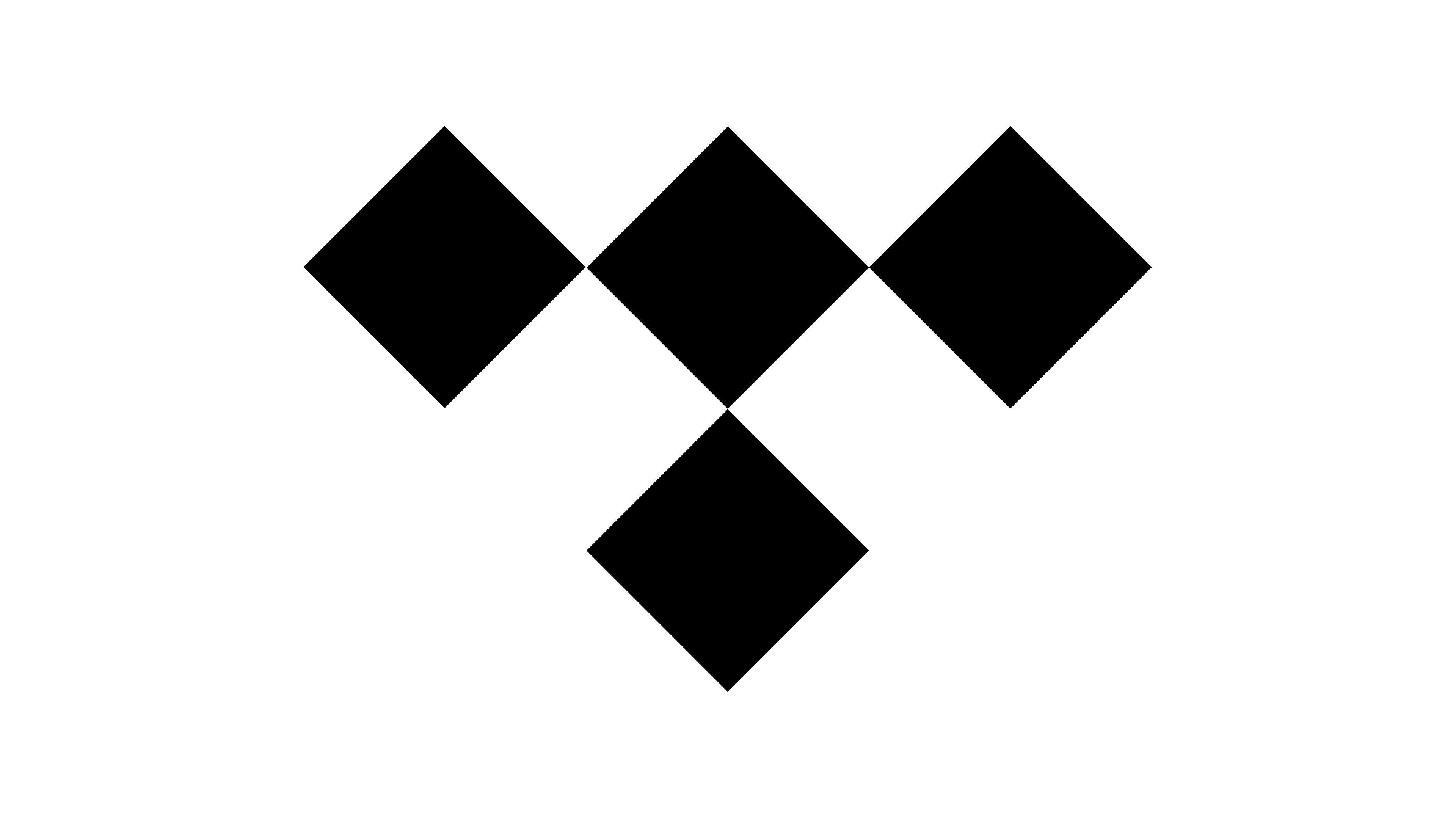
What’s more, the geometric emblem makes a clear reference to the diamond theme, thus also alluding to glamour and style. It might be a symbol of the lights illuminating the stage in a music venue and the way it is reflected in the jewelry fans are wearing.
In comparison with the emblem, the wordmark may appear a little generic. The type is an unpretentious sans with homogeneous thickness of the lines.
Colors and font
The minimalist color scheme including only black and white results in a clean and highly flexible design. When placed over the lighter background, the emblem is black, while the darker backgrounds may result in a reversed color scheme. In any case, this combination of colors gives designers a chance to play with the logo using it in various visual contexts.
The uppercase sans seen on the Tidal logo resembles the font family known under the name of Keep Calm. It was inspired by a now legendary WWII poster created in 1939 and rediscovered in 2000. According to the legend, the poster was never issued. In 2000s, the font family went through a comprehensive update.


