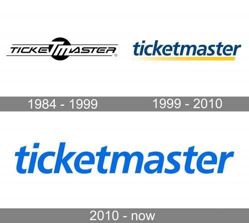
Nothing in the Ticketmaster logo of can tell you that it belongs to a ticket sales and distribution company. And yet, Ticketmaster does benefit from the dynamic style of its visual brand identity.
Meaning and history
The company was registered in Phoenix, Arizona in 1976. Since then, its logo has gone through at least four modifications. While the design was sometimes redrawn from scratch, it has always preserved the feeling of implied motion. This is pivotal for the brand as speed is its core promise – this is what clients expect when they use Ticketmaster.
What is Ticketmaster
Ticketmaster Entertainment, Inc. is a large California-based ticket sales and distribution company working in different corners of the globe. Since 2010, it has been a subsidiary of Live Nation Entertainment.
1984 – 1999
The oldest version on the list features the name of the brand in a futuristic all-caps type. Some of the glyphs are connected (take, for instance, the “C” and “K” or the “S” and “T”). Conversely, other glyphs have gaps in utterly unpredictable places (take, for example, the “E’s,” the “R” or the “A”).
The central part of the design is formed by the letters “T” and “M” looking bolder and larger than all the other glyphs. Together with the black circle behind, they form something that can be used as a standalone icon, as the letters are the initials of the brand’s name.
The fact that the typeface used for the wordmark is light and italicized is but another way of implying motion and speed, which, as we have already mentioned, is the brand’s promise.
1999 – 2010
The updated Ticketmaster logo comes across as less cluttered. It is more in line with current design trends requiring minimalism.
Here, the wordmark is made up of lowercase letters. They are italicized (to imply speed) but look somewhat bolder than those in the previous version. If not for the unfinished central bar of the “e’s,” the type would have looked generic. Also, the unfinished line emphasizes dynamism.
The yellow stripe serves the same purpose. It can be interpreted as an object moving at a high speed and leaving a trace behind, which gradually fades out.
Also, the colors – dark blue creating a vivid contrast with yellow – have added an individual and emotional touch to the emblem.
2010 – present
Another update took place in 2010, when the company merged with Live Nation and started to work under the name of Live Nation Entertainment.
The logo modification, though, was comparatively subtle. The gold bar disappeared leaving the design even simpler than it used to be. In one of the versions, color was still used – a lighter shade of blue over the white background.
Colors and font
The simplicity of the font used on the Ticketmaster logo is deceptive. In spite of its austere style, choosing and adapting this highly dynamic typeface with the unusual “e’s” definitely took some doing.
On the website, the wordmark is negative (white) over a vivid blue background. Yet, it’s not the only color scheme possible.


