ThyssenKrupp is one of the biggest steel companies in the world, which was established in 1999 in Germany. The company operates worldwide and is mostly popular for its elevator systems.
Meaning and history

The ThyssenKrupp visual identity is a result of two companies merging, Thyssen and Krupp. The new brand design contains elements of both businesses’ logos.
The Arch has been a symbol of Thyssen since 1976. The logo was designed by Schierning, the graphic artist from Hamburg, who was inspired by the shape of the pavilion at the industrial show. The Arch was a reflection of all the company’s activities.
As for the three rings emblem, it has been a symbol of the Krupp company since 1875. The insignia is a reminder of Krupp’s most famous patent from 1853 — seamless railway tires.
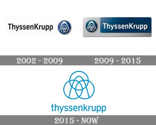
2002 — 2009

In the version of the ThyssenKrupp logo released in 2002, you could see the name of the company to the left of the emblem. The wordmark was given in black letters over the white background. The glyphs had traditional proportions and belonged to a highly legible sans serif typeface.
The pictorial part showcased a dark blue roundel housing a silver emblem (the arch and the three rings).
2009 — 2015

Now, the text was to the right of the emblem. The wordmark was white inside a dark blue square with rounded corners. Also, the two parts of the logo (typographical and pictorial) were joined together by a larger silver rectangle, into which both of them were placed.
2015 — Today

The ThyssenKrupp logo from today is composed of a wordmark with an emblem, which combines two parts — the arch and the three rings. Placed above the lettering, the company’s symbol is light and elegant, executed in thin white lines.
The ThyssenKrupp nameplate in all the lowercase lettering is written in a traditional sans-serif typeface with elegant stencils. The letters are balanced and bold, looking friendly and loyal to the light blue background of the brand’s logo.
The light blue and white color palette of the ThyssenKrupp logo evokes a kind and pleasant feeling, showing the company as creative and innovative, yet with a huge value of its roots and heritage.


