Hinduja Group, a conglomerate headquartered in London, is steered by the Hinduja family, with brothers Srichand, Gopichand, Prakash, and Ashok at its helm. Primarily engaged in a plethora of sectors including finance, IT, healthcare, and automotive, its global presence spans over 38 countries across five continents.
Meaning and history
Founded by Parmanand Deepchand Hinduja in 1914, the Hinduja Group has since evolved into a global powerhouse with its foothold in various industries. Recognized for significant ventures like Ashok Leyland in automotive and IndusInd Bank in finance, the conglomerate has showcased an adept prowess in blending traditional values with modern business sensibilities. Today, under the leadership of the four Hinduja brothers, the Group remains influential, continuing its legacy of innovation and forward-thinking strategies while adapting to contemporary global challenges.
What is Hinduja Group?
Hinduja Group is a London-based global conglomerate spanning various sectors such as finance, IT, healthcare, and automotive. Guided by the Hinduja family, it has a significant presence in over 38 countries.
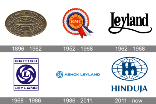
1896 – 1962
The earliest logo appears to be done on a real piece of metal. The border and all the other elements are raised above the flat oval-shaped base. Curved at the top, “Leyland Motors Limited” is printed using all uppercase letters without serifs. “Leyland England” is printed using the same font at the bottom. The center had another oval frame with “Makers and Patentees” printed inside. The logo looked simple, yet there was something strong about it.
1952 – 1968
The new logo resembles a reward badge rather than a logo. A red round emblem is decorated by a ribbon in patriotic colors. It also has several thin yellow lines that create a border. In the center, the logo has the abbreviated name printed in bold, serif font of a yellow color. The full name, which was now changed to The British Motor Corporation Ltd., was now printed around the border of the round emblem.
1962 – 1968
The updated logo looks very different from the earlier version as it features only a black inscription. It said “Leyland” using a cursive font with bracketed serifs. The letters “L” and “Y” had long, curved strokes that joined and underlined the whole word. There are no other elements. Combined with the choice of colors, the logo turned out very solid and sophisticated.
1968 – 1986
The updated logo had a rectangular form with a round emblem carrying an “L”. It had spinning elements that created a feeling of movement and dynamics. The inscription “British Leyland” was printed above and below the circle using a sans-serif font very similar to Mortend – Extended Family and all uppercase letters. The blue and white instilled a feeling of trust and confidence.
1986 – 2011
The visual identity is constantly being updated to reflect the new name and create a more universal brand image that will cover the expanding list of company directions. The logo now featured “Ashok Leyland” printed using all uppercase letters using a geometric, sans-serif typeface with cutting edge. It was done in a sky-blue, which was also used for the round emblem. The latter moved to the left of the name.
2011 – now
To create a new global corporate identity the company introduced a new logo with “Hinduja”, the founder’s name, printed using a font that looks surprisingly similar to Ophian Bold. The whole logo is done in blue color with a white background. Above the name, the logo features an outline of a globe with bold uppercase and lowercase “H” being printed right next to each other.


