VIDgital is the name of a television production company, which was established in Moscow in 1987. The company was founded by a group of friends-journalists with the idea of giving alternative vision through tv programs. Today VIDgital keeps producing various programs and tv shows.
Meaning and history
With the beginning of the era of glasnost in the USSR, local television took on new colors. A new wave of free journalists appeared, creating interesting television content. As a result, there was a pool of young, successful journalists who wanted to create their own projects. In order to unite them under one wing, the creative association “Vzglyad” (can be translated into English as “View” or “Point of view”) was founded on October 2, 1987, based on the program of the same name.
The VIDgital visual identity is something truly unique, as for many people it evokes no other feeling but fear. This is pretty understandable if you take a look at the early versions of the emblem.
The VID logo became iconic on Russian television. It was constantly being changed at the request of viewers, who sent numerous complaints to the channel’s addresses. In the Russian segment of the Internet, the mask was the subject of numerous memes too.
1990 – 2000
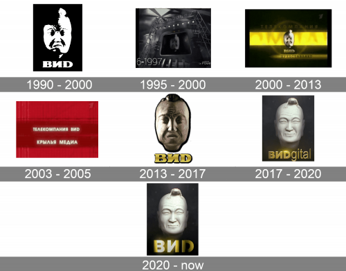
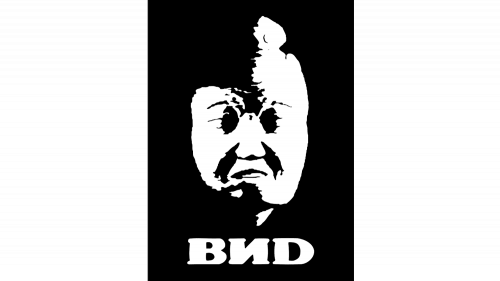
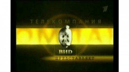
The original VID logo was created in 1990. The idea to use the mask of Chinese philosopher Guo Xiang belongs to the wife of one of the tv channel’s founders (She worked in the Museum of Oriental Art). The suggestion was approved and the designers recreated a mask, based on the one from the museum. The Museum prohibited the use of the exact copy of the mask, so the toad was placed on the head of the philosopher. In Eastern mythology, the toad symbolizes wealth and power. The three-dimensional mask in white was set on black background above an extra-bold white lettering in Russian.
1995 – 2000
In 1995 the mask remained untouched, but the lettering got the volume too. The contours of the uppercase bold letters were refined and the color got some gradients, which could be silver or gold, depending on the placement. Overall, not much was changed with this redesign.
2000 – 2013
The redesign of 2000 worked with the background of the logo, and it actually softened the harsh and scary mood of the first versions. Originally, the logo was thought to represent high art and elegance. In reality, however, the symbol became synonymous with the appearance of a spirit, a villain, and a sorcerer. So with the redesign of the 2000s, and the new shiny gradient gold and black background, the logo got a bit closer to its original idea. But still not much.
2003 – 2005
For several months the tv company used simple lettering in sans-serif, with no graphical components in the logo. It was a clean and strict typeface, usually uppercase letters, and solid contrasting backgrounds. A very boring solution, compared to the iconic mask concept.
2013 – 2017
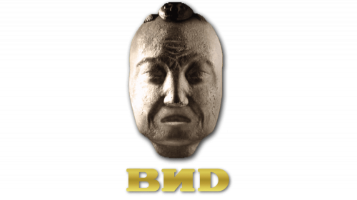
The redesign of 2013 introduced a new version of the logo with the new mask, that has a more distinct clay texture, but looked even creepier than the original insignia. The new natural shade of the mask was complemented by a gradient gold logotype in an extra-bold serif typeface. The lettering in Russian was placed under the mask.
2017 – 2020
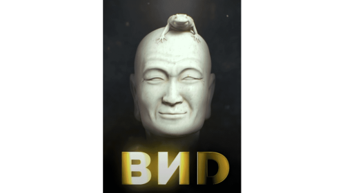
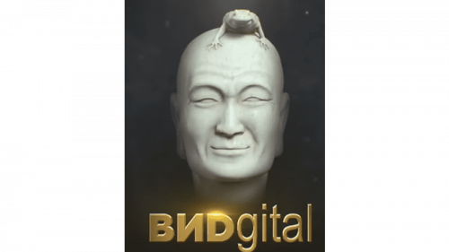
The name of the company was changed from VID to VIDgital in 2017, and to celebrate the new era of the brand, its visual identity was completely redesigned. The mask was remodeled and started looking super modern and even cool. As for the toad, it also lost its fearful appearance, being executed very realistically. The gradient shades were coming out of the gold three-dimensional lettering in classic Arial typeface, with one part bolder, and another, the lowercase one, thinner and lighter.
2020 – Today
The logo, introduced in 2017, with the smiling head of a smiling Guo Xiang, got refined in 2020. Removing golden shining of the letters, and making the shapes and contours of the mask cleaner and stricter. The wordmark was shortened to VID again, and the overall mood of the logo was bright back to simplicity, professionalism, and confidence.


