 Nicktoons (United States) Logo PNG
Nicktoons is the name of a specialized tv channel, owned by Nickelodeon and uniting all the cartoons, created by the company. The channel was launched in 2000, and today is available all over the globe, with its content translated into several languages.
Meaning and history
Nicktoons is one of the Nickelodeon sub-brands, a tv channel, that specializes in only cartoons, and is owned by the Viacom Group. The Nicktoons channel features the most famous and beloved cartoons, specially selected for boys and girls ages 6 to 10. Initially, the channel was showing archive programs, but today a lot of original content can be seen on Nicktoons.
Today Nicktoons, which was launched in Great Britain in 2000, and in the United States in 2002, is available in several European and African countries, with many of the series and animated movies translated into different languages, so that kids from all over the world could enjoy a fun and lively content.
What is Nicktoons?
Nicktoons is going to be of the Nickelodeon channels, which was established at the beginning of the 2000s, as a platform for all the Nickelodeon cartoons. Today the channel is available in Europe, the USA, Australia, and some African countries.
As for the visual identity, the Nicktoons logo slightly varies from country to country, and the version of the American channel looks very bright and progressive, with many redesigns made to it throughout the years
2002 – 2003
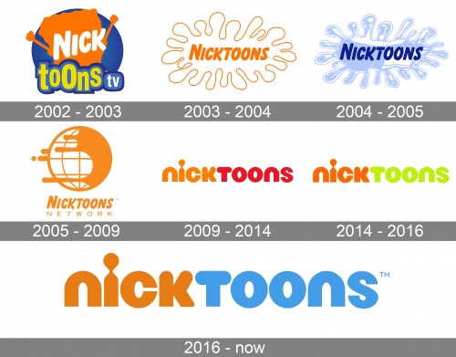
The very first Nicktoons USA logo saw the light in 2002 and stayed with the channel for just a few months. It was a very colorful badge with a solid blue circle in the background, an orange silhouette of Sponge Bob, one of the main characters of the channel, and the lettering in two different styles: the white “Nick” written over the Sponge Bob, a repeating the corporate Nickelodeon style, and the lowercase “Toons TV” in yellow, blue and white, written at the bottom of the badge.
2003 – 2004
The redesign of 2003 has introduced a completely different badge, executed in orange and white and looking very fresh and quite minimalistic. The bold orange name of the channel was written against a white background, repeating the corporate Nickelodeon typeface, and being enclosed into a fantasy smooth frame with a thin orange outline.
2004 – 2005
In 2004 the color palette of the Nicktoons visual identity was switched to smooth blue and purple, with a lot of white. The smooth framing of the badge now looked like a jellyfish, making the concept unique and instantly recognizable. The inscription kept its corporate style but started looking completely different in an intense shade of purple, used for its bold italicized letters.
2005 – 2009
The redesign of 2005 introduced a badge with the new name of the channel, the Nicktoons Networks, and brought back the orange and white color palette of the logo. Now the bold orange logotype with the uppercase sans-serif “Network” tagline was placed under a graphical emblem, depicting a stylized globe with its right part drawn in solid orange, and the left one — in white with thin orange orbits.
2009 – 2014
The refined Nicktoons badge saw the light in 2009, right after the channel was named back, and with the “Network” part removed. The new logo concept was built around bold lowercase lettering, set in a smooth and heavy sans-serif typeface, created by Eric Zim HippieHouse design bureau. The first part of the logotype is set in orange, while the “Toons” uses a classic shade of red.
2014 – 2016
The color palette of the Nicktoons logo was changed in 2014, with the orange getting lighter, and the red replaced by acid green, with the shade close to lime. It was created by Sibling Rivalry Studio, which decided to keep the custom typeface of the lettering, and its recognizable letter “I”.
2016 – Today
The 2016 redesign was held by the Sibling Rivalry Studio again, and it was also just about the colors, as all the shapes remained untouched. The new palette is based on a combination of intense orange and blue, which looked fresh, progressive, and energetic.
Font and color
The heavy and smooth lowercase lettering from the primary Nicktoons logo
is set in a custom sans-serif typeface, which looks pretty close to such fonts as Publica Play Black and Eastman Grotesque Alternate Black, but with most contours refined and softened.
As for the color palette of the Nicktoons visual identity, it is based on the corporate shade of orange, complemented by a delightful and bright shade of blue, standing for the sky and endless opportunities of life.


