Nick Jr Productions is the name of the studio, which was established at the beginning of the 1990s in the United States. The studio is known for its animations and a very popular all over the globe Nickelodeon channel, which has intense and versatile content from children’s cartoons to educational programs.
Meaning and history
The logo of Nick Jr Productions has always been based on the iconic Nickelodeon badge, with two bright figures in orange and blue. Originally it was about human figures, which later changed to various options — birds, dinosaurs, frogs, and other animals, but all of the images were instantly recognizable due to the use of one color palette and memorable style of drawing.
1993 – 2000
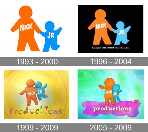
The very first logo for the studio was introduced in 1993 and featured a delightful image with two stylized figures — one in orange, and the other one in light blue, with the white “Nick Jr” lettering on them. The orange figure was an adult and had “Nick” along with his chest, he was holding the small blue figure’s hand. This parent and child were placed whether in a white or black background.
1996 – 2004
The redesign of 1996 kept the black background and slightly refined the contours of the image. The animalistic versions of the logo also appeared during this period. They all boasted the same color palette and had the “Nick Jr” inscriptions over their bodies.
1999 – 2009
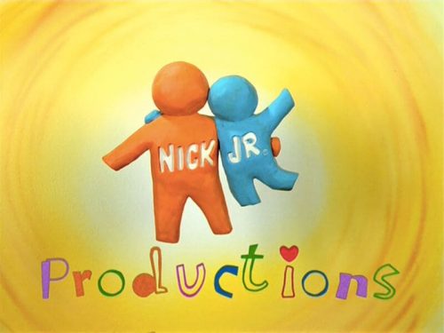
In 1999 the brighter version with the additional “Productions” lettering saw the light. The figures became three-dimensional, made of colored clay, and the background was changed from black to gradient yellow, with a swirl, becoming white in the middle. As for the “Production” wordmark, it was written in a custom typeface with all the letters outlined in different colors. It was a very friendly and playful logo.
2005 – 2009
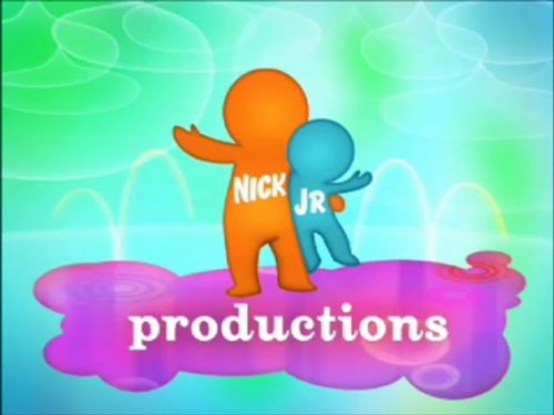
In 2005 the logo was redrawn again, and this version was used along with the one from 1999, until 2009. The blue and orange figures were drawn on a gradient turquoise, blue and green background. They were standing on a purple and fuchsia cloud with white “Productions” lettering on it. The inscription was executed in a fancy and smooth typeface with all the letters in the lowercase.


