The Simpsons is an iconic animated tv-series, which was created in 1989 and by today has almost 700 episodes released. It is a comedy, which tells the story of a funny American family, with a lot of sharp sarcastic jokes.
Meaning and history
The Simpsons is the most famous cartoon family on American television, which has not aged for more than thirty years. Moreover, The Simpsons is the longest-running animated series in the history of American television. The trial mini-episode of the cartoon was released in 1987, and on December 17, 1989, the animated series officially started on Fox.
That was legendary cartoonist Matt Groening, who came up with the idea for The Simpsons. He even named the characters after members of his own family and made them yellow to make them stand out. All members of the Simpson family are based on the characters of Matt Groening’s family members. Except for Bart, who is a composite image of Matt himself and his older brother. And the Name “Bart” is an anagram from the slang word “brat”, which can mean rascal.
The Simpsons is a series that mocks the usual image of the average American and affects the life of the world as a whole. The authors of the series satirical form discuss all the acute social and political problems and pass a sharp word on the famous figures of history and modern culture.
The series likes to resort to the use of bright famous personalities in episodic roles and quoting expressions from modern and classic movies. And this only adds to the arguments for the social significance of The Simpsons’ importance in modern culture. In 1998, according to Time magazine, “The Simpsons” became the best TV series of the 20th century.
As well as the animation itself, The Simpsons’ logo is probably one of the most recognizable among animation films all over the globe. Composed of a single wordmark, it looks modern and reflects the humorous and sarcastic character of the TV series.
1987 – 1989

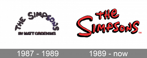
The very first logo of the iconic cartoon series was designed in 1987 and stayed with The Simpsons for a couple of years. It was a monochrome badge with the arched wordmark in a custom bold typeface, which looked pretty much the same as the font we all can see on the logo today. The bottom line of the insignia had a stricter and straighter “By Matt Groening” inscription, which was set in the same color and also used only capital letters.
1989 – Today
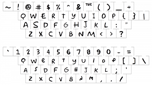
The Simpsons nameplate is written in two levels with “The” places above the central part of “Simpsons”. The inscription in all the capitals is executed in a custom hand-drawn typeface with uneven edges artsy lines. After the release of the tv-series, the font, named Simpson was designed by Sharkshock.
The color palette of The Simpsons’ logo is red with a black outline and shadow. The bright and slightly aggressive color combination of the animation’s casual identity allows placing in on various backgrounds without losing its sharpness.
The Simpsons logo is timeless. It is truly a classic example of the contemporary an-imation industry and reflects the free and rebellious spirit of young people, who are brave and energetic.


