

![]() The Prodigy logo PNG
The Prodigy logo PNG
The Prodigy is a British electronic music group playing in the genre of electronic music. The band was among the pioneers of the big beat style in music. It was founded in 1990 by Liam Howlett, who was also the author of the songs that made up their first mini-album released in 1991. Quite soon the musicians became popular at home and then abroad, first in Italy and some other countries. By now, the group has sold more than 25 million copies of its albums.
Meaning and history
![]()
The musical history of The Prodigy band began in 1990, when their first single “What evil Lurks” appeared. The single did not go unnoticed and immediately got into rotation in various clubs.
After the successful release of their debut single, the band toured the UK, performing mostly in small underground clubs. But already their first foreign concert in Italy was enthusiastically received by the Italian ravers. They proclaimed Prodigy to be the best band in the rave scene of that time.
On August 12 of1991 Prodigy released their second single – the legendary “Charly”. Their third single “Everybody In The Place” appeared in December 1991. Next was the single “Fire”, and in 1992 the band recorded their first album, Experience, which stayed on top of the Top 40 charts for six months.
Since then the band steadily released new singles and albums, one of which did not go unnoticed. Even today Prodigy is considered a legend, a pioneer in their style, and a band that has always produced incredibly high-quality music content.
What is The Prodigy?
The Prodigy is the name of a British music band, which was formed in 1990 and is considered to be one of the most influential collectives in alternative electronic music. By 2023 the band has released seven studio albums, with the first, Experience, introduced in 1992.
1990 — 1991
![]() During the three decades of its history, the band has changed several logos. The very first existed only from 1990 to 1991.
During the three decades of its history, the band has changed several logos. The very first existed only from 1990 to 1991.
1990 — 1996
![]()
In 1990 the band starts using a monochrome logo in Escher style. It was a circular badge with a psychedelic pattern in its central part, where the voluminous letter “P” appeared. The whole wordmark was written on a white outline of the badge and executed in an extended sans-serif typeface, with its uppercase letters massive and solid.
1991
![]()
In 1991 the new logotype was introduced by Prodigy. A lowercase inscription in a custom typeface with thick solid lines and shapes and an enlarged dot above the “I”. The wordmark was underlined with the thin stretched rectangular from which two short and thin lines came out to the sides.
1991 — 1996
![]()
Another logo created in 1991 featured the same style of lettering as on the previous badge, but with thicker lines and a double white and blue outline of each letter. There was no underline of this version, but a small rounded rectangular with “The” in the lowercase, glued to the dot above the “I”, in its right.
1993 — 1994
![]()
The logo changes its shape in 1994, now the enlarged letters of the inscription look like they are “hugging” a globe. The first and last letters of the wordmark can barely be seen.
1994 — 1996
![]()
The same concept was refined in 1994. This time the letters got smaller which made them all visible, though the “globe” disposition remained, it was not that obvious on this version.
1995 — 1996
![]()
In 1995 the band adopts a new symbol — Ant — which become iconic and synonymous with it in no time. The new logo featured bold white lettering on a black background, with the letter “O” enlarged and having a white image of the insect inside.
1996 — 2004
![]()
The redesign of 1996 made the lettering leas bright and placed it on a rounded horizontally stretched black badge, putting the white circle with a black ant on its right. The inscription was executed in the lowercase of a contoured sans-serif typeface.
1999
![]()
For just one year, in 1999, the band used another logo design — a black handwritten wordmark was placed in the right from a solid black circle with the white ant silhouette on it. This badge looked cool and very modern.
2001 — 2002
![]()
The ant was removed from the Prodigy visual identity in 2001. The new logo featured massive geometric lettering in two levels executed in black and enclosed into a thin square frame. The letter “O” was replaced by a solid black circle with a white five-pointed star on it.
2004 — 2008
![]()
The logo from 2004 can be called the most minimalist in the Prodigy visual identity history. It was a bold sans-serif inscription where black uppercase letters were complemented by a delicate cursive “The” above the letter “P”.
2005 — 2008
![]()
The logo goes three-dimensional in 2008. A completely new style and color palette were introduced by the band. It was a traditional and classy blue ribbon in a silver outline. The ribbon was arched and had its ends curved. The solver lettering in the uppercase was written on a bright blue background, using a simple and neat serif typeface.
2008 — 2009
![]()
The logo goes three-dimensional in 2008. A completely new style and color palette were introduced by the band. It was a traditional and classy blue ribbon in a silver outline. The ribbon was arched and had its ends curved. The solver lettering in the uppercase was written on a bright blue background, using a simple and neat serif typeface.
2009 — Today
![]()
The logo we all can see today was introduced in 2009 and featured a black logotype placed on a white background. The custom typeface of the inscription featured straight geometric lines with sharp triangular ends and a very strong character. The logotype is set diagonally and has its “The” part written in small letters and placed on the left from the “P”.
2015 — Today
![]()
The badge, created for the band in 2009, was refined in 2015, keeping the contours and style of the original version, but adding a more interesting pattern to the dark gray and black characters. The blurred yet still straight and sharp contours of the characters started looking unique and evoking a very mysterious feeling.
2017
![]()
In 2015 another version of the logo created in 2009 was introduced. It featured the same shapes and concept, shout the color palette was enlightened, adding more white to the ends of the letters.
Font
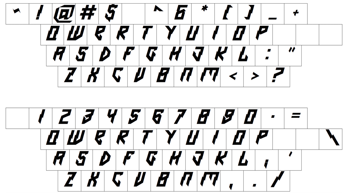
Font and Color
The custom lettering from the primary badge of The Prodigy is set in a sharp geometric font, which was designed exclusively for the band. The closest typefaces to the one, used in this insignia, are, probably, Electrical Tape, or Bloody Murder, but with significant modifications of the contours.
As for the color palette of The Prodigy’s visual identity, it is based on dark gray and black gradients with some additions of white. The sharp lettering looks powerful and dramatic in these shades, representing the band and its music better than anything else.


