GOT7 is one of the most popular K-pop boys’ bands, which was established by JYP Entertainment in 2014, and consisted of seven members. The band got disbanded in 2021, after the members refused to resign from the contract with their label, but came back in 2022.
Meaning and history
GOT7 was one of the most popular groups in South Korea. Some members made their debut on stage even before the creation of the group. The group officially debuted in early 2014. It became a real musical event in the South Korean music industry. The group’s record company is one of the most popular and influential in South Korea.
GOT7 was under the wing of JYP Entertainment from the time of its debut, beginning on January 16, 2014, until its contract expired on January 19, 2021, which was the date of the group’s official breakup. On January 11, JYP Entertainment officially confirmed that all seven members did not renegotiate their contracts.
The guys immediately made themselves known as strong musicians. Their debut mini-album reached the top of the international Billboard music chart. The first performance as a group took place in the framework of a music show.
A few months later the second mini-album was released. Many noted that it sounded different, and the music became more dynamic and vivid. The artists were noticed in Japan, where they began to frequently travel with concerts.
The popularity of GOT7 grew. Their popularity in Japan helped them record their second track in Japanese. The first full-length album in Japan was already released in 2016 and consisted of 12 tracks.
The group continued to increase the army of fans of their talent. Musicians began to be invited not only to TV shows but also to fashion shows as models. As a result, the guys became the face of a Thai brand of sweet soft drinks. After that, the members decided to try themselves as producers of their own songs and music videos.
In 2018, the GOT7 band began a global tour that lasted through the summer.
In early 2021, rumors began to circulate about the band breaking up. The information was eventually confirmed. The musicians last performed at the Golden Disk Awards music ceremony. In 2022 GOT7 came back with a new label and refreshed visual identity.
The group has seven members: Jay B, who was the leader of the group, its main singer and dancer; Mark; Jackson; Jinyoung; Young-Jae; BamBam; and Yugyeom.
What is GOT7?
GOT7 was a Korean pop band with an original format. The combination of vocals with cool shows made this Boyz band incredibly popular. One of the most famous K-pop bands was disbanded in 2021 but has gloriously come back in 2022.
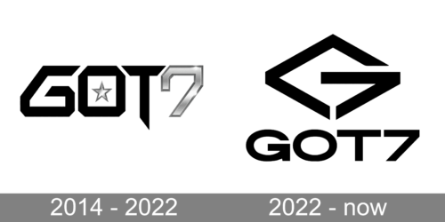
In terms of visual identity, GOT7 is all about stability. The band has had only one logo redesign, and it happened after they come back in 2022. Even though the badge was significantly changed, its initial idea can still be seen in the refined version.
2014 – 2022
The original GOT7 logo was introduced in 2014 and featured a stylized wordmark in black and silver with a small silver five-pointed star set in the negative space of the letter “O”. The color of the star was also used for the “7”, which was set on the right from the black lettering in the same size and same style as all of the characters.
2022 – Today
The redesign of 2022 has changed the concept of the GOT7 logo, and now it is composed of an emblem, underlined by an uppercase wordmark. Both elements are set in flat black. The emblem depicts a stylized letter “G” with its tail drawn as a digit “7”. The letter is executed in a shape of a rhombus. As for the lettering, it has changed its typeface to a more traditional one, with rounded full-shaped letters balancing the straight lines and angles of the emblem.
Font and color
The bold uppercase lettering from the primary GOT7 logo is set in a modern and confident sans-serif typeface with thick lines and distinctive contours of the characters. The closest fonts to the one, used in this insignia, are, probably, Specify Extra Expanded Black, or Grillmaster Expanded Extra Bold, with a very recognizable arrow-like tail of the “G”.
As for the color palette of the GOT7 visual identity, it is based on flat black, with the logo usually depicted on a plain white background. A timeless and very stylish choice.


