Ariana Grande is a famous pop-star and actress, who was born in 1993 in the United States. She became popular in 2008 and since that time he released five albums and earned numerous prestigious music awards.
Meaning and history
The visual identity design of Ariana Grande changed smoothly along with her own style and music. It all started from slightly naive images, which turned into a confident and stylish insignia, which is now instantly recognizable across the globe.
2011 — 2013

The initial Ariana Grande logo was designed for her first single, released in 2011. The visual identity was composed of a diagonally placed logotype, set in two levels, and the portrait of a singer on its right. Both elements were located on a striped pink and white background.
The “Ariana Grande” lettering in curved cursive was written over a bright yellow element with three white blinking stars. There was a very obvious and cool vintage feeling in this picture, which at the same time accented the singer’s uniqueness and individuality.
2013 — 2014
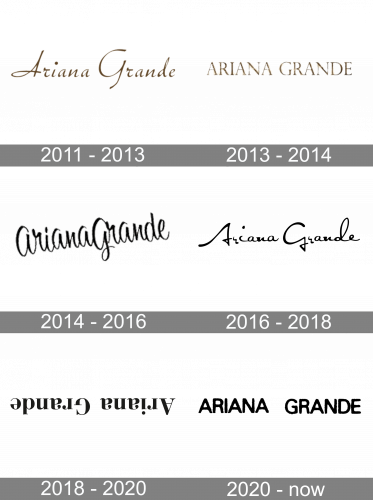
In 2013 Ariana goes more minimalist and elegant. There were two versions of the logo used during this year by the singer. One was a logotype in a very thin and fine sans-serif typeface, which was usually executed in white and placed on a sea-blue or purple background.
The second option was a sparkling gold inscription in all capitals, executed in a classic and sleek serif font, and placed on a white background. Both nameplates looked chic and timeless, reflecting the singer’s style and sense of beauty.
2014 — 2016

In 2014 there were two more versions designed — one of them was a script lettering in white and black, looking modern and young, yet with a touch of classiness and elegance. The second logotype was written in a bold serif font with slightly curved lines and very thin serifs. Drawn in white and placed on a gray background, the Didot-like font, made the logo look like the fashion-magazine title.
2016 — 2018

In 2016 Ariana Grande releases her new album, “Dangerous Woman”, where the new logo is placed on the cover. Despite the strong and aggressive title, the logotype looks sophisticated, yet confident and powerful.
The singer’s name in a custom cursive typeface is placed above the enlarged “Dangerous Woman” inscription in all-caps of the fancy serif font.
The color palette of the logo was composed of black for all the lettering, and light gray with white for the striped background.
2018 — 2020
Definitely, the most recognizable singer’s logo was designed in 2018 for her album “Sweetener”. It is a simple inscription in a traditional serif font with bold smooth lines and slightly curved tail of the small letters “A”. But the logotype is turned upside-down, which makes it unique and super cool.
2020 — Today

The 2020 singer’s name is written in smooth, bold and grainy characters. The two words are placed far from each other, but the letters have little gaps in-between.


