

Like any other product, sometimes logos are outdated and updated. Its modernity and originality determines the interest of potential consumers that is why it is necessary to keep up with the times and fashion for graphic design sports clubs.
Logos become obsolete
The phrase “the logos become obsolete” is often understood as the following – for club, for some reason, this graphics solution no longer seems to perform the essential functions, that is to represent a sports team in a befitting way.
What determines the obsolescence of the logo? How do logos go out of fashion?
In fact, logos are subject to almost the same laws as other areas of design – graphic, industrial and others.
Colour combination
First of all, fashion affects the colour combinations. What used to be acceptable yesterday is totally unacceptable today. So, raster images have been replaced by vector images, with its clear forms and boundaries, and the combination of a large number of colours gave way to conciseness and 2-3 corporate colours of the club.
Nevertheless, it seems that many logos, so familiar and therefore attractive to long-time fans of the club, are more than modern. But a “fresh look” shows that it is not so. For example, today there are fewer logos with a lot of small details, because drawing (and using of many colours) not only increases the cost of implementing the logo, but also worsens perception of the logo.
Fashion goes away … and comes back
But fashion trends are often cyclical, and what was at the peak of fashion the day before yesterday, again becomes a trend. And then we wonder how modern look those logos that have gone into oblivion itself or together with the clubs, or gave way to new design developments.
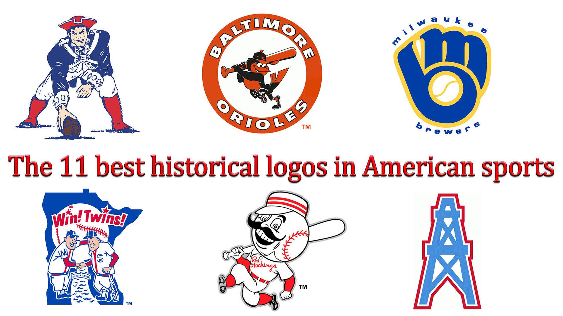
We have collected for you the top-11 best historical logos of American sports. They will help you to get acquainted with the history of graphic design and, at the same time, to remember those clubs that were loved and popular in the more or less old.
Of course, our top-11 can easily turn into a top-30 or top-50, but we collect really the best logos. Those, when looking at which today we are happy to remember the great sports battles of the past, familiar to us from the stories of our parents, or the history of our schools. So, the best ever existed (but no longer valid) logos of sports teams in the United States for your attention.
11. Washington Bullets (1987-1997)
![]()
The logo of the Washington Bullets basketball club has been existed for only ten years, but without exaggeration, its original design allowed it to go down in history. Stylized letter “l” turned into hands of players, outstretching to the ball static in the flight.
10. New England Patriots (1971 – 1992)
![]()
Despite the fact that the New England Patriots logo was created in the last third of the twentieth century, a character in a historical costume was used for it. The three-colour logo, made in the colours of the American flag, is a complex design with a large number of small elements. However, for the fans and for the players of New England Patriots, this concentrated and dynamic image was more than appropriate, so the logo has existed for more than 20 years.
9. Houston Colt .45S (1962 – 1964)
![]()
The time when the Houston Colt logo was used as an active logo is limited by two years only. However, the clarity of the design and the use of only two colours allowed it has pride of place among other historical logos, which had left a noticeable mark in American sports. Moreover, the “C” in the word “Colt”, slightly changed, had turned from an ordinary letter into a bright smoke that occurs because of a shot that had added dynamics to the graphic image.
8. Minnesota Twins (1976 – 1986)
![]()
Logo of Minnesota Twins represented the sport that unites even swore competitors. Indeed, clubs meet on the field to find out who is stronger in the sport, but this process is nothing more than an opportunity not only to measure themselves, but also to find friends. As two banks of the river are connected by a bridge, the players who came out on the field, are united with each other by handshakes.
7. Buffalo Bills (1970 – 1973)
![]()
The monochrome logo of Buffalo Bills had to serve as the official sign of the team for less than four years. Nevertheless, sports fans remembered its bright red colour (which, as we know, turns quite a peaceful bull into an angry locomotive) and the complete absence of sharp corners.
6. Milwaukee Brewers (1978 – 1993)
![]()
The main colour of the Milwaukee Brewers logo is dark blue. The light yellow contour, which occupies sufficient space, is actually almost invisible, and only performs the technical function of the stroke. The combination of stylized letters “M” and “B” create a reference to the sport (the ball in the center of the letter “b”), but can also be considered as a stylized fist.
5. Cincinnati Reds (1954 – 1959)
![]()
The cheerful mustachioed “baseball player” on the Cincinnati Reds logo is a kind of caricature. His head is hypertrophied (it’s a ball), the bat on his shoulder is also disproportionately large (but thanks to this disproportion it is obvious that if you want the player will always hit the big ball with his bat). The key colours of the image are red and white, the combination of which is enough contrast to create the necessary dynamics. However, black strokes were used to emphasize the logo and to make it more clear and in the center of the image there was a black mustache.
4. New York Jets (1963)
![]()
The New York Jets logo would be more suitable for the air carrier, but it has existed for some time as a symbol of the sports club. A compact monochrome airplane with the inscription Jets on board was designed to create the image of a club successfully overcoming enormous distances.
3. Baltimore Orioles (1966 – 1988)
![]()
The logo of the baseball club Baltimore Orioles includes a proud bird-player – the symbol of the club. The team’s house colours – black and orange – create a bright image. The name of the team was placed on the orange circle, which contains the logo. The logo was jokingly called “flotation ring”, and this is the case why the club have used this symbol over 20 years.
2. Philadelphia Eagles (1948 – 1960)
![]()
The monochrome image of the attacking eagle of the Philadelphia Eagles logo, unlike many other graphic designs, emphasizes the aggressive desire to win. Cut corners on paint (the club’s corporate colour is green, it also became the main colour of the logo), the designers paid attention to the drawing of the wings, tail and claws of the bird of prey.
1. Houston Oilers (1980 – 1996)
![]()
The Houston Oilers logo was designed against the design stereotypes and does not contain a single mention of the sport. There is a tower used for oil production, on the logo. The main colour is blue, which in contrast with crimson contour creates a certain image filled with internal stress.


