

Logo is one of the directions of art, more and more actively influencing the economic cultural, and legal problems of the subjects of culture and the country. Space and art are closely related: the former gives ideas for art and creativity, and the latter helps to find non-standard solutions to fundamental and applied problems.
The theme of space has become popular not only for projects that are associated with it. Advertising campaigns in spacesuits depicting satellites and rockets are launched by brands from completely different categories. Millennials and Generation Z value new experiences more than material possessions. They are more willing to spend money on traveling than buying a car. And brands see space marketing as an opportunity to jump into space. And customers value getting a glimpse of what the future holds. What is the secret of the popularity of space themes in advertising and what the future holds, we will try to find out in this article.
The Past
Of course, the most durable and famous logo from the space field is the NASA emblem. The main U.S. space agency called National Aeronautics and Space Administration (NASA) was founded in 1958.
The emblem, which is now used by the American Space Agency, was developed in 1959. In 1975, the logo was updated – it was engaged in the studio Danne & Blackburn. This version existed until 1992. People nicknamed this logo a worm, but changed it for a reason – in the image of 1959 were enough details, and therefore it was difficult to apply.
However, in 1992, the federal agency returned the round symbol, deciding that it was more authentic and reminded of the main achievement of NASA – the landing of a man on the moon. Nevertheless, it is the “worm” that took root in popular culture as a symbol of American astronautics. However, since 1992 it has been used only on merch and in the media.
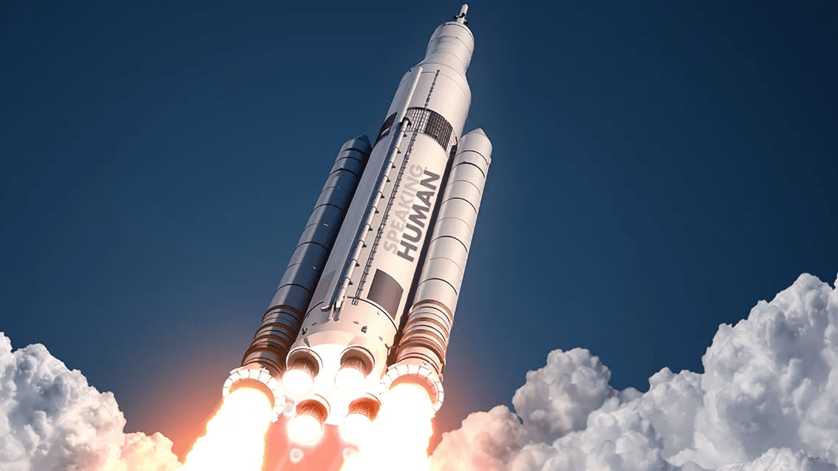
In 2020, the American space forces officially revived this symbol – it appeared on the rocket. It was this logo that branded Elon Musk’s SpaceX Falcon 9 with NASA astronauts on board.
The Today
![]()
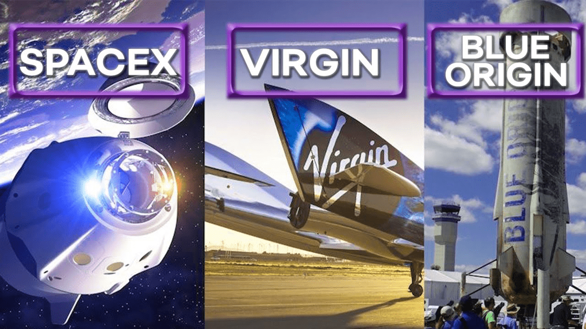
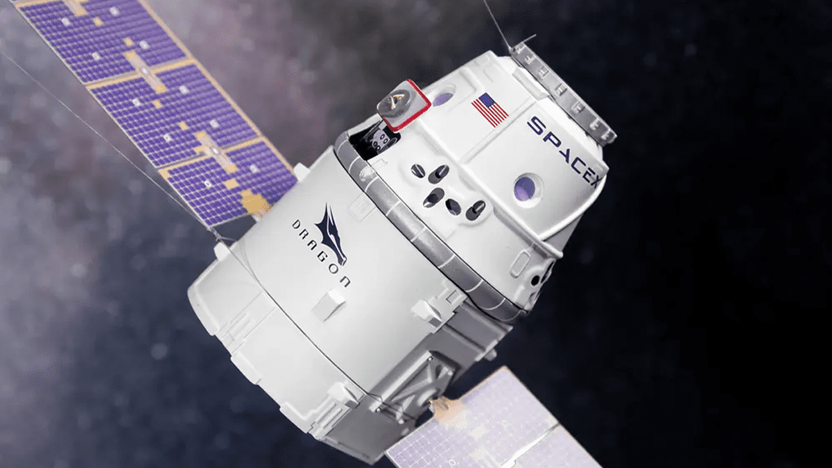
SpaceX, founded by Elon Musk in 2002, has become one of the most famous and successful private space companies. It is known for its innovative Falcon and Crew Dragon rockets, as well as its plans to colonize Mars. The modern logo of the company was designed by the American studio RO Studio, which created the identity for other projects Musk – for example, for the company of electric cars Tesla and a series of launch vehicles Falcon. The SpaceX logo looks very technological, and is only accentuated by the enlarged “X”, which stands for “eXploration”. According to Elon Musk, the company’s founder and CEO, the stylized letter “X” is meant to indicate the flight path of the rocket.
![]()
Blue Origin is another private company, founded by a person who had nothing to do with space before, namely Jeff Bezos, founder of Amazon. One of the main goals of Blue Origin is to popularize human colonization of space. As for the company’s logo, it has no graphic reference to the theme of space at all. And this is what “popularization” is all about, allowing ordinary people to feel closer to something unfathomable. As conceived by Bezos himself, the flying feather on the logo symbolizes the freedom of space exploration and the ease of it. At least, that’s what the company is aiming for.
![]()
Virgin Galactic, founded by Richard Branson, is a pioneer in commercial space tourism. During the company’s existence, its symbol has undergone several subtle modifications but has not changed globally. Perhaps, at the moment, it is the most “space” logo. The stylized rocket flying upwards best translates the company’s sphere of activity, and its global aims, and the gradient pink and purple color scheme emphasizes creativity and new solutions. All this is complemented by one of the world’s most recognizable insignias, the script “Virgin” logotype in modest white.
![]()
In 2014, rocket company Firefly Space Systems was founded in Austin, Texas, but things didn’t go well right away, and the company’s operations were pretty much suspended. In 2017, the startup was relaunched as Firefly Aerospace. The project supports the idea of New Space, which aims to increase access to space. As for the company’s logo, it broadcasts futurism and the future rather than affordability. The stylized insect in lemon yellow flies upward like a rocket, and the sharp design font with geometric shapes represent a stable “ground”.
![]()
California-based Moon Express plans to mine minerals on the moon and is developing robotic systems to send on lunar expeditions. The startup was a finalist in the Google Lunar Xprize, the winner of which was supposed to explore the moon, but the competition was canceled. The basic design of the company’s logo is a clear geometry of lines. The emblem is a stylized letter “M” and “E”, each made up of three straight lines – vertical for M and horizontal for E. This minimalism brings us as close as possible to the future, in which a flight to the Moon will be something commonplace.
![]()
The Rocket Lab company is engaged in rocket building and launching satellites into space. The company was founded by New Zealander Peter Back in 2006, and in 2010 the startup signed a contract with the U.S. government. The Rocket Lab logo resembles some fantastic robot moving at an incredible speed. Even the classic tricolor of black white and red looks incredibly progressive here. The company bet on brevity and futuristic forms – and the bet played out. The fiery Red “plume” remaining behind the white part of the letter “R” works as the main accent.
The Future
Private space programs in the United States represent a new era in space exploration and commercialization. Investment in these programs has led to innovation, lowered the cost of space launches, and opened up new opportunities for commercial space exploration. Companies such as SpaceX, Blue Origin, and Virgin Galactic continue to grow and attract investors and public interest. Their successes and achievements demonstrate the promising future of commercial space programs and the contribution of the private sector to space exploration and development.
As for trends in the logos of space-related companies, it is more difficult to predict. As you may have seen, the major players in this market most often do not use elements directly related to their activities (with rare exceptions). They rather prefer stylized fonts and sharp geometric shapes that only hint at themes related to space and the future. It is the “Future” that is the connecting link in the visual identity of all the companies we have described above.
However, the theme of space is actively used by brands from other spheres, and most likely furthermore, because as soon as something becomes popular, it immediately begins to be used in marketing to increase sales. So let’s wait for the Space Boom in logo design and branding. After all, the space logo is an important branding element that helps a company stand out in the market and create a recognizable image. For startups, choosing this theme in design also means a quick take-off and a breakthrough in the industry. Well, for existing global brands space theme is rather used as a “seasonal promotion in addition to corporate emblems, or as a new platform for advertising.
Conclusion
The most popular of all space logos is, of course, the blue meatball logo from NASA. It is legendary, it is iconic, and it goes deep into history – it was used back in 1959. And retro is always in trend. It is part of the global trend this emblem has become. Today it can be seen on all sorts of surfaces – from posters and key chains to ultra-fashionable designer things. And this quite proves the relevance of the space theme.
It is noteworthy that most brands that have nothing to do with space tourism and development use the space theme for promotion. And companies that work in this field, prefer not to speculate the public consciousness. You can read the concern for humanity in their communications. They announce launches of rockets and satellites, share the results of missions, research: oceanic, atmospheric, and others, as well as conduct educational and outreach activities. Really strong players in today’s space industry market prefer minimalism and veiled graphic hints of a flight to the moon.
And in general, space is just great. It has always attracted and will always attract people with a palette of feelings and emotions. After all, who among us in childhood did not dream of becoming a cosmonaut? So with this theme, all people have associations with exclusively positive and joyful associations, and a good mood is the strongest engine of sales.


