Texas A&M Aggies is a collegiate athletic program of the Texas A&M University, located in Brazos County. Today the program consists of twenty men’s and women’s teams in various sports disciplines and is best known for its men’s football club.
Meaning and history
The athletic program from Texas A&M University, established in 1876, Texas A&M Aggies (derived from “agriculture”), is considered to be one of the strongest in the National Collegiate Athletic Association, having won 13 NCAA team national championships.
The program consists of 9 men’s and 11 women’s teams, competing in such sports disciplines as Basketball, Baseball, Soccer, Swimming &Diving, and several others. The most famous team in the program is Texas A&M Aggies men’s football club.
What is Texas A&M Aggie?
Texas A&M Aggies is the name of the university sports program, created in the Texas A&M University in the middle of the 20th century. The program has 20 teams in Baseball, Basketball, Football, Tennis, and other sport disciplines.
1876 – 1907
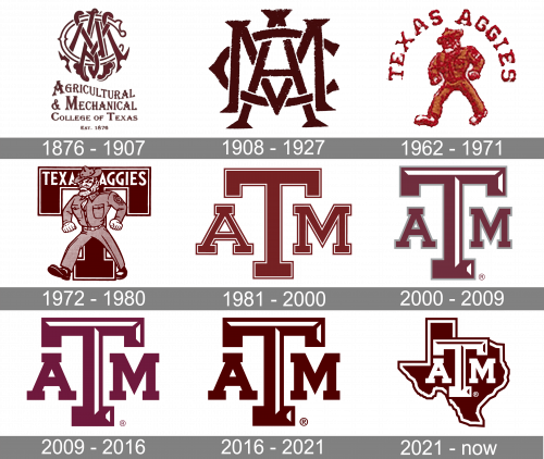
 Back in 1876, the athletic logo of Texas A&M University featured a monogram that looked like a rope tied many times around a large “C.”
1908 – 1927
 The 1908 logo was also pretty elaborate but a little bit more legible.
1962 – 1971
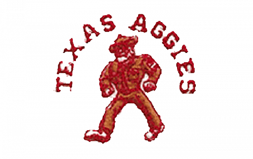 The 1962 and 1972 emblems featured a stylized male figure.
1972 – 1980
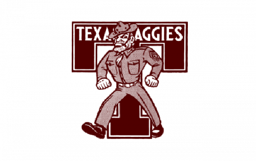
In 1972 the badge was refined and redrawn with straighter and cleaner lines, in a new burgundy and white color palette, which stayed with the clubs for years. It was the same man figure, but now all the elements and details of the drawing were distinct and strong. The man was placed on the burgundy and white background with an enlarged solid letter “T” in a double outline. Both elements were sent in white, and the badge looked powerful and memorable.
1981 – 2000
 Since 1981, the school has stuck to a simpler emblem sporting the letters “A,” “T,” and “M.”
2000 – 2009
The logo of the club was redesigned again in 2000, keeping the composition from the previous version, but redrawing the letters in a more modern way, with the contours cleaned and slightly narrowed. The badge now featured its symbols in a darker shade of burgundy and with more white accents, which added geometry and motion to the image.
2009 – 2016
The redesign of 2009 introduced a modernized version of the Texas A&M visual identity. The letters of the badge were enlarged and emboldened, keeping the iconic burgundy color palette and straight geometric contours untouched. The letter “T” became a true star of the emblem, evoking a sense of confidence and stability.
2016 – 2021
The logo took on a darker brown shade in 2016.
2021 – Today
The emblem still used the stylistic acronym image from the previous logos, but with inverted colors. It was placed in the middle of the map of Texas, which had the same dark brown look with white and then brown rims along the edges.
Font and color
The massive geometric lettering from the official logo of Texas A&M Aggies is set in an extra-bold geometric serif typeface, which is pretty close to such fonts as Comply Slab Extra Bold and Hudson NY Pro Slab Semi Bold, the types, which are most often used by colleges and universities across the United States.
As for the color palette of the Aggies’ visual identity, it is based on the combination of white and burgundy, two traditional shades, which together create a composition, representing excellence, professionalism, and determination.
Texas A&M Aggies Colors
MAROON
HEX COLOR: #500000;
RGB: (80, 0, 0)
CMYK: (15, 100, 39, 69)
PANTONE: PMS 7421 C
WHITE
HEX COLOR: #FFFFFF;
RGB: (255, 255, 255)
CMYK: (0, 0, 0, 0)


