Tennessee Aquarium was opened in 1992 in Chattanooga and today is one of the biggest in America. The aquarium with more than ten thousand animals hosted over 20 million visitors throughout its history.
Meaning and history
Tennessee Aquarium has a very memorable and beautiful logo, which is composed of a wordmark and an emblem, that is usually placed above it or in its left.
The classic all capital lettering of the wordmark is executed in a serif font with clear lines and enough space between the letters. It is elegant and light. The blue color of the nameplate elevates the style and sophistication.
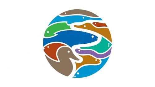
The most interesting part of the Tennessee Aquarium’s visual identity is its emblem. The blue solid circle depicts several white curved lines, that form the marine animals’ silhouettes. One of the lines is thicker than others and resembles a river drawn on the map.
Sometimes the Aquarium uses a multicolor version of the emblem. Based on calm, earthy colors, it looks natural and evokes a sense of friendliness.
The Tennessee Aquarium logo is timeless and fine, it is a perfect example of how the public entertainment spots can be shown. Simple, yet modern and with huge attention to details.


