TapouT is an American brand of casual and sportswear, which was established in 1997. Today it is one of the America’s and world’s largest companies in the industry.
Meaning and history
The TapouT brand began its history as a complete underground movement. In 1996, the companions came up with a brand name, Tapout,a name that was really related to sports, and came to the consensus that it was the right name. They didn’t have any money, but after raising a few hundred dollars, they printed T-shirts with the TapouT logo on them.
At that time, closed combat tournaments were very popular, and had very limited attendance. It was there that the founders of TapouT advertised and marketed the then-unknown brand.
Now TapouT is a full range of training equipment that meets the standards of the world. The company’s training equipment is characterized by a discreet design without bright drawings. This equipment is a particular classic of the MMA world.
What is TapouT?
TapouTis the name of a brand, that is known all over the world. It was formed inthe United States in 1996. In 20 years of development the company managed to earn an excellent reputation, and today TapouT products are sold on all continents, being synonymous with style and quality.
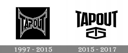
1997 – 2015

The old TapouT logo already featured the arc effect that is the distinctive feature of the current version.
Originally, the arc was more pronounced. There were unusual details in some of the letters, for instance, the “A” (the extended bar), the “P” (the gap), and the “U” (the shortened right end).
Also, the black letters had a white and black outline. It didn’t make the design cleaner and slightly damaged the legibility.
2015 – 2017
The TapouT logo is a good example of the sport lifestyle brand’s identity. It is sharp, energetic and powerful. The logo is composed of a wordmark and the label’s symbol.
The wordmark is executed in a classic bold font with straight and neat lines. The letters are getting smaller while moving to the center of the nameplate, with the big letters “T” on both sides. It evokes the sense of growth and the brand’s huge coverage.
The emblem is a geometrical representation of the brand’s name. It is composed of the letters “T” and “O”, where the “T” is drawn as an arrow, looking up, and coming out of angular “O”.
As TapouT works closely with gyms and sports drinks and supplements companies, it’s logo is very universal, and can be placed on any package, keeping its confidence and trustworthy. It is clean and simple, yet powerful and energetic.
Font and Color
The stylish geometric lettering from the primary at spout badge is set in a heavy custom sans-serif typeface with angular contours of the uppercase characters. The closest fonts to the one, used in this insignia, are, probably, Authority Regular, or Behover College, but with the shape of the letter “A” significantly modified.
As for the color palette of the TapouT visual identity, its simplicity balances the heavy shapes and modern mood of the lettering. The color scheme is based on a laconic combination of black and white, which in this case stands for strength, determination and energy.


