Takis is a very popular brand of snacks in the United States, which has been on the market since the beginning of the 2000th. And recently, thanks to TikTok, a new wave of popularity has swept over them. Takis is a cornmeal snack with different flavors and different spiciness.
Meaning and history
Takis is a fun and flavorful interpretation of traditional tortilla chips with a characteristic curled design for extra crispness. It is because of its unusual shape that these chips have become so popular. Spicy corn rolls Takis, made like the popular taquitos, were born in sunny Mexico in 1999 and were first introduced in America in 2006. And in 2013, Takis already became the best-selling salty snack in Los Angeles.
Today the Takis chips are available in different flavors: Takis Fuego, Takis Blue Heat, and Takis Crunchy Fajitas. Most Takis flavors are vegan, but some contain animal-derived ingredients like cheese or milk powder.
Takis chips, popular in America, are still made in Mexico for Barcel USA LLC. You can find the snacks of this brand not only in North America but also in some European countries, the United Kingdom, Japan, South Korea, and the Middle East.
What is Takis?
Takis is the name of a brand of corn-based snacks produced by the Mexican snack company Barcel, which was first introduced in 1999 in Mexico and in 2006 in the United States. It is an appetizer in the form of corn rolls similar to taquitos.
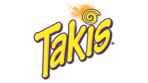
In terms of visual identity, Takis is bright, sunny, and very friendly. The most long-lasting logo of the brand was introduced in 2012 and still looks actual and eye-catching.
2012 – Today
The Takis logo, created in 2012, is composed of a graphical wordmark, written diagonally against a transparent background in a modified sans-serif typeface with rounded cuts of the bars. The bright yellow bodies of the letters are outlined in purple, creating a strong color contrast. The logo is decorated by a stylized dot above the “I”, which looks like a swirl, drawn in the same yellow and purple palette, but with an orange Flame on top.
Font and color
The custom lettering from the primary logo of the Takis chips brand is set in a smooth typeface, which is based on Tekton Bold, a font with thick bars and softened contours. The diagonal disposition of the lettering adds playfulness and switches the proportions.
As for the color palette of the Takis visual identity, it is based on the combination of yellow and purple, where yellow symbolizes the sun, and the shade of corn, the main ingredient of the tortilla chips, and purple make up a perfect framing for the laconic image.


