Tabasco is an American brand of a hot-sauce manufacturer, established by Edmund McIlhenny in 1868. Today the label is a part of McIlhenny group and its products are distributed all over the world.
Meaning and history
Tabasco is one of the brands, which decided not to change its originally created logo and keep going with the same visual identity since the very beginning of the company’s history. It says a lot about the values of traditions and heritage.
???? – Today
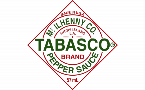
The Tabasco logo is composed of a rhombus with a double circle inside and a wordmark. The contours of the geometric figures are red as well as the small-lettered inscriptions “Made in the USA”, “Avery Island LA” and “Since 1868”. All the lettering of the Tabasco logo is in all-caps.
The main wordmark is executed in the same sans-serif typeface, which is Helvetica Bold. Its green letters are placed horizontally in the center of the rhombus, while the “McIlhenny Co” and “Pepper Sauce” in the same font and color are arched and located between two red circles.
The logo is light and simple, yet became symbolic and is instantly recognizable across the globe. It looks perfect on a brand’s sauce bottles and the calm red of the Tabasco product works as a great contrasting background for the tag.


