Swansea City is the name of a professional football club from Wales, which was founded in 1912. Today the club plays in the second-tier league of the English football system, usually taking positions in the middle of the championship’s ranking. The team has Swansea.com Stadium as its home arena and Russel Martin as its head coach.
Meaning and history
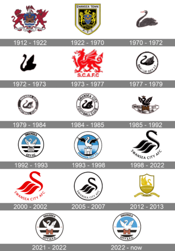
During the first 60 years of its history, the Swansea City Association Football Club used a badge heavily based on the crest of its home city. Since the 1970s, the core component of the badge was a swan.
1912 – 1922
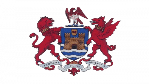
The team started its history in 1912 under the name of the Swansea Town. The first emblem it used was just the coat of arms of its home city, Swansea, Wales. There was a castle with two towers symbolizing the castle of Henry de Beaumont (1099), around which the town grew up, a rampant lion, and a dragon.
1922 – 1970
The second Swansea City FC logo (1922) featured almost the same components, although they were redrawn using a slightly different style, color palette, and overall proportions.
1970 – 1972
Since 1970, when the following logo was adopted, the football club has been experimenting with completely different types of logo, which featured a swan. Initially, it was just a dark grey swan with a yellow beak. Two years later, an all-black swan logo was introduced.
1972 – 1973
In 1972 the black swan was redrawn in a more modern and abstract way, with fewer details than on the previous version. The new badge looked very recognizable but had a completely different mood from the badge, created in 1970. Bold lines, not very clean contours, and absolutely no additional elements made the Swansea City logo look stylish and mysterious.
1973 – 1977
In 1973-1977, the team temporarily switched to a red dragon badge. However, eventually, the black swan made a comeback. Now, it could be seen inside a black circle.
1977 – 1979
In the 1979 version, the black ring became bolder. Also, it held the name of the team in white.
1979 – 1984
The redesign of 1979 kept the black swan almost unchanged but made it a bit smaller to fit into a new composition. It was still a circular black-and-white badge, but now the white medallion boasted a thick black outline, where the bold white “Swansea City Football Club” inscription in the uppercase of a simple sans-serif typeface was written around the perimeter.
1984 – 1985
In 1984 the Swansea City FC logo was slightly refined. The black framing turned white with a thin black outline, and the lettering became black. As for the typeface and the swan in the center of the badge, they got emboldened and enlarged, with the mascot bird getting darker and its lines thicker, and the inscription — more massive and concrete.
1985 – 1992
The redesign of 1985 introduced a new concept for the Swansea City football club visual identity. Although the iconic bird was still there’d all the elements were changed and redrawn. Now the swan had its wings opened and its head embellished with the crown. It was sitting in a composition of two ribbons — the horizontally stretched one with the “Swansea City” in the uppercase of a traditional serif typeface and the ribbon, etched from the center with the “Football Club”, also in all caps of the same font.
1992 – 1993
In addition to black and white, the 1992 and 1993 Swansea City logo also featured shades of blue. However, the color logo didn’t last long.
1993 – 1998
The redesign of 1993 modernized the new blue white and black Swansea City FC badge, emboldening and elongating the lines of the bird’s wings, softening the gradient blue background, and rewriting the inscription. The new “Swansea City FC” wordmark was arched along the bottom part of the circular frame of the badge, in medium-blue color, with the use of a bold geometric sans-serif typeface.
1998 – 2022
The most famous and recognizable badge for the football club was created in 1998 and is still used by Swansea City FC as the official primary insignia. It is a three-dimensional stylized image of a black swan, which is now facing right. The bird is formed by several frags placed with some space between each other. Each of the drags boasts a sleek matte surface with a bit of gradient. The chic black image is complemented by an uppercase “Swansea City AFC” inscription in a sophisticated sans-serif, arched under it.
2000 – 2002
For less than two years, at the beginning of the 2000s, the club has been using the flat version of its iconic badge. It was a two-dimensional swan with an arched inscription under it, executed in a classic red and placed on a white background. In the new color palette, the logo looked completely different — passionate and very energetic.
2005 – 2007
The redesign of 2005 brought the logo back to its black and white color palette, though kept the two-dimensional design. This time the image with the lettering under it was placed on a white background and enclosed into a thin black circular frame. With the new distinct shape the badge looked more interesting on the uniforms of the football club, and still kept the mood and feeling of the original version from 1998.
2012 – 2013
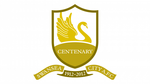
For the 100th anniversary of the Swansea City Football Club, the new logo was designed. The celebration badge was executed in a gold and white color palette and combined an image of the ironic bird with traditional crest and smooth elegant ribbons, where the white serif lettering was placed. Inside the shield, under the swan, there was a “Centenary” wordmark written in the uppercase, and under the crest, a small dark gold banner with the white “1912 — 2012” datemark.
2021 – 2022
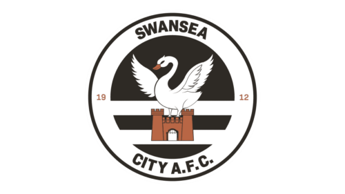
The 2021 emblem is a secondary logo used as a sort of homage to the older emblems. It’s based on the earlier blue versions with miniature castles in them. This one has the same swan, but the background is mostly black with horizontal white lines. The castle is now brown. There is still the club’s name in the outer frame, colored black.
2022 – Today
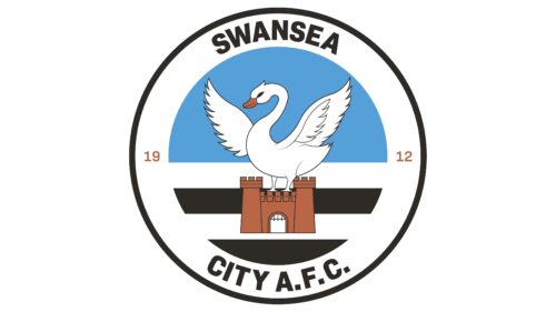
The football club brought back the blue sky. Otherwise, there were no visible modifications to all the elements’ shapes or positions. Yet, such a small change greatly impacted the overall appearance. Besides referencing earlier versions, it instantly created a happier mood and hinted at the bright future of the club.
Colors
The palette has been based on the combination of black and white since 1970. While the uniforms also feature other colors (yellow, red, blue), the Swansea City logo stays achromatic.
Swansea City Colors
BLACK
HEX COLOR: #121212;
RGB(18, 18, 18)
HSL(0, 0%, 7%)
CMYK: (0,0,0,1)


