The roots of English football club Newcastle United go back to the football team established by the Stanley Cricket Club at the end of 1981. The Newcastle United Football Club itself was officially found 11 years later, in 1892, as a result of the merger of two clubs. It became part of the Football League in 1893.
Meaning and history
The original badge was an exact replica of the emblem of the team’s home city, Newcastle upon Tyne. According to the official version of the team’s history, the city crest made its first appearance on the uniforms back in 1911. It was more than half a century later, only in 1969, that the city crest was promoted to the status of the official Newcastle United FC logo.
The main components of the city crest are Castle Keep reminding of the Norman era and two seahorses (one from each side) symbolizing seafaring heritage. There’s also a lion with a flag depicting the St. George’s Cross.
1969 – 1976
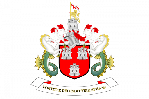
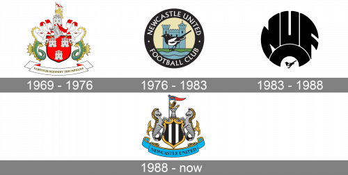
One of the first logos of the club was introduced in 1969 and featured an ornate and traditional composition with a scarlet-red crest surrounded by two mythological creatures — horses with dragon tails — from the sides, a castle with a flag on it on top, and a neat horizontally stretched ribbon with the lettering under it. On the red background, there were three white and gray castle images placed, just like the one, that was standing above the shield. On that one there was also a gold lion rampant and a white drag with a Red Cross on it. The upper castle was placed on top of the silver-gray knight helmet, which replaced the crown, traditionally drawn on heraldic insignias. As for the two horses, they were drawn in the white and yellow palettes, with the long curved dragon tails in green and yellow. The lettering on a white ribbon featured the motto of the club in Latin: “Fortiter Defendit Triumphs” in all capitals. This can be translated as “Triumphing by the brave defense”.
1976 – 1983
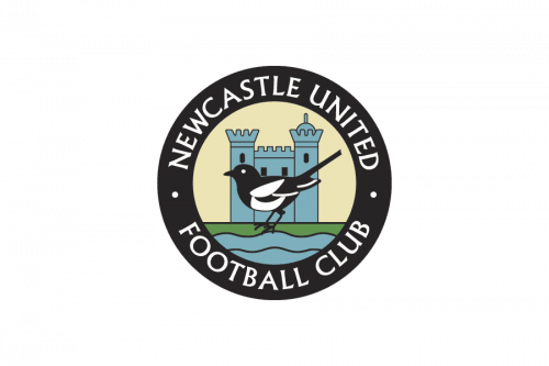 The following crest, which was adopted in 1976, was a more club-specific one. Although it still had Castle Keep as its central component, it was now depicted in a different, more straightforward style. Below, the River Tyne could be seen. The design served as a background to a magpie reminding that the team has been nicknamed “The Magpies.” The image was encircled by the team’s name in white over a black background.
1983 – 1988
 The 1983 NUFC logo was entirely different in style. Here, bold letters “NUF” were squeezed in a roundel shape, with an upturned “C” below. The only component borrowed from the previous version was the magpie, which now grew much smaller.
1988 – Today
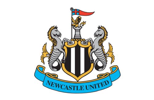 Surprisingly, the current badge is closer to the city crest than its predecessors. Back are the seahorses, the castle, and the lion with a flag.
Color
In addition to the iconic black and white stripes, the Newcastle United logo features elements colored grey, blue, and yellow.
Newcastle United Colors
BLACK
PANTONE: PMS BLACK 6 C
HTML HEX COLOR: #241F20;
RGB: (45, 41, 38)
CMYK: (63, 62, 59, 94)
WHITE
HEX COLOR: #FFFFFF;
RGB: (255, 255, 255)
CMYK: (0, 0, 0, 0)
BLUE
PANTONE: PMS 298 C
HTML HEX COLOR: #41B6E6;
RGB: (65, 182, 230)
CMYK: (67, 2, 0, 0)
GOLD
PANTONE: PMS 142 C
HTML HEX COLOR: #F1BE48;
RGB: (241, 190, 72)
CMYK: (0, 24, 78, 0)


