Supreme, a pioneering streetwear brand, was established by James Jebbia in 1994. Rooted in the culture of skateboarding, the brand has grown to symbolize the convergence of art, music, and fashion. Jebbia, the visionary behind Supreme, has steered the brand into a global phenomenon. Supreme’s operational heart lies in New York City, specifically in the bustling area of downtown Manhattan, yet its influence stretches globally, with flagship stores in major cities such as Los Angeles, Paris, and Tokyo. The brand’s unique approach to fashion, characterized by limited runs of products and exclusive collaborations with artists and brands like Hanes, North Face, and even high-fashion houses, has cemented its status as a symbol of youth culture and consumerism. Its iconic logo, a red rectangle with white Futura text, is instantly recognizable and has become a status symbol among enthusiasts and celebrities alike, including figures such as Justin Bieber and Michael Jordan. Supreme’s success is not just measured by its popularity but also its ability to remain relevant in the ever-evolving landscape of fashion and street culture.
Meaning and history
The emblem was introduced in 1994, when the first Supreme store opened on Lafayette Street in New York. According to Jebbia, it cost $12,000 to open it. The store was to sell such brands as Zoo York, Shorty’s, and Spitfire, but Jebbia also wanted to mark the opening day with a unique T-shirt designed specifically for the occasion.
He had three T-shirts to choose from: one of them featured a 1970s skater, another sported Travis Bickle, the main hero of the Taxi Driver thriller (1976), while the third one was decorated with the simple box logo of the Supreme store.
The emblem wouldn’t have appeared if not for a friend of James Jebbia, the company founder. The friend didn’t like the original designs claiming they lacked identity. So, he gave the designers a book describing works of Barbara Kruger, one of the US most known conceptual artists and collagists, to use as a source of inspiration.
What is Supreme?
Supreme is a streetwear brand that epitomizes the fusion of skateboarding, art, and fashion. Established in New York City, it has risen to global prominence, celebrated for its artwork, collaborations, and iconic Supreme logo. A symbol of youth culture and status, its products, from hoodies to accessories, command immense popularity and resale value.
Primary logo
The final logo drew inspiration (or, as some people put it, was “lifted) from Kruger’s poster created in support of legal abortion. It featured a woman’s face divided in two parts with the lettering “Your body is a battleground” in white against a bright red background. The style of the Supreme logo copied the style of the lettering.
Such “inspirations” in street culture have been a matter of heated discussions for decades. Take, for instance, the Stussy brand and its logo clearly based on the Chanel’s interlocking “C’s”.
New versions of the symbol
The brand makes T-shirts with modified versions of its logo for some occasions. For instance, it produced a BOGO benefit tee in 2011 after the earthquake in Japan and donated all the sale proceeds to the country’s Red Cross.
In 2017, the brand dedicated a new version of its box logo to the late writer and cultural scholar Gary Warnett.
Emblem controversy
The connection between the brand’s logo with the recognizable style of Barbara Kruger is obvious. Moreover, James Jebbia, the company founder, actually confirmed that the Supreme logo was borrowed from her work.
The artist herself hasn’t filed any lawsuits against the brand. One of the reasons could be that she didn’t have intellectual property rights on it. She did make a statement in this respect, though. It was when Supreme sued Leah McSweeney, the founder of Married to the Mob, for her parodical logo “Supreme Bitch” based on the Supreme wordmark. Barbara Kruger called both the parties “uncool jokers” and said she won’t be surprised if eventually they sued her for copyright infringement.
As for the Supreme’s lawsuit against McSweeney, it ended with an agreement that MTTM could use the words “Supreme Bitch,” but the design should be different.
Font
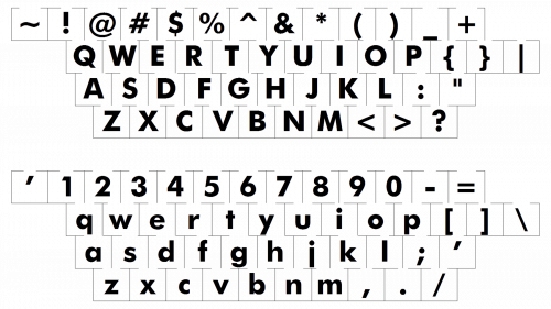
The logo is based on the rather popular font called Futura Heavy Oblique. It is a sans serif italicized type created by Paul Renner in 1927.
What is the Supreme logo based on?
The logo of the famous fashion brand supreme is not as simple as it may seem and has an idea behind its creation. The founder of the company was inspired by the poster, designed by Barbara Kruger in support of abortions. After he saw that poster, he decided to dive deeper into feminist art, and made serious research, finding out, that there is one common thread connecting them all: red color and italicized lettering.
How much is the Supreme logo worth?
The Supreme logo did not cost a fortune for the brand. It cost absolutely nothing, as the idea of the design came to the company‘s founder, and its execution was it difficult: the sans-serif italicized lettering in the bright shade of red.


