The name “Supergirl” has been used for more than one superheroine character of comic books introduced by DC Comics. The first and best-known of them is Kara Zor-El, the cousin of Superman.
Meaning and history
The Supergirl logo has been always influenced by the emblem of Superman. In many cases, it looked the same.
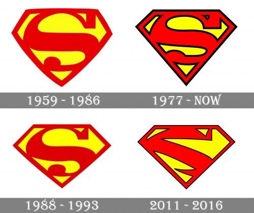
1959 – 1986
Kara Zor-El as Supergirl first appeared in Action Comics #252 (1959). The character was the result of the collaboration between Otto Binder and Al Plastino.
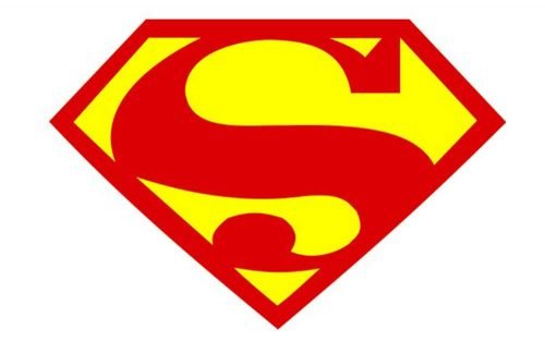
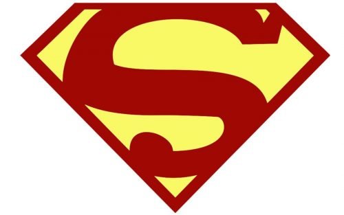
The original version of Supergirl’s emblem copies Superman’s emblem of the same period (it was introduced in 1955 and used until 1986). You could see the red letter “S” inside a yellow diamond with red trim.
1970 – present
There was also an additional logo used during this period. The most notable difference was the thin black trim going along all the lines and strokes. Due to the black border, the design got more depth.
Also, there was a couple of tweaks in the shape of the elements. The two upper sides of the diamond grew shorter, while the two lower sides grew straight (they used to be rounded in the previous version). The angle between the upper and lower sides became sharper.
The top end of the “S” became slightly wider and curvier. The dot on the lower end was flattened.
On the whole, this version looked sharper, edgier.
1988 – 1993
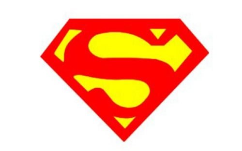
This one looks more like the original 1959 logo due to the lack of the black border. Yet, here, the angles between the lower and upper sides of the diamond are sharper, while the sides are straight, which makes the logo similar to the alternative emblem introduced in 1977.
2011 – 2016
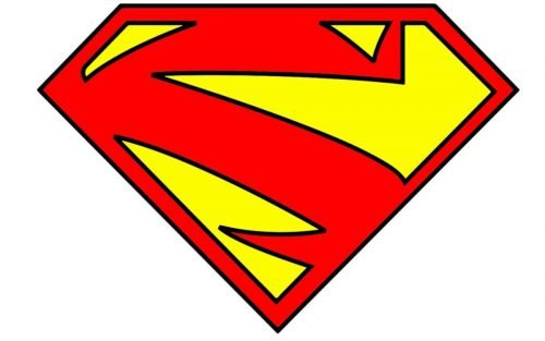
The New 52 comics of this period featured an even edgier version. Not only the diamond looked angular but the “S” as well due to its sharp ends and straightened sides.
Alternative versions (other media)
1984 (the movie with Helen Slater)
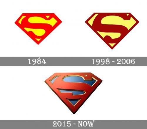
The shape of the “S” in this version was smoother. This could be partly explained by the fact that, in a movie, you typically see the logo in motion, so it needs to be simpler and easier to grasp. The design copied that of the emblem used by Christopher Reeve in all four Superman movies.
1998 – 2006
This version was used in at least three releases: “Superman: The Animated Series,” “Justice LeagueUnlimited” and a crossover part in “The New Batman Adventures.”
The distinctive feature of the Supergirl logo here is the darker shade of red and the muted yellow.
2015 – present
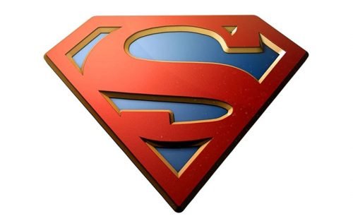
You can often come across a version where the red “S” is placed over the blue background. The symbol can be either 3D or flat.


