

![]() Transformers Logo PNG
Transformers Logo PNG
One of the most popular media franchises was born in the 1980s, when the toy lines Microman and Diaclone were created in Japan. The toys were an immense success, and shortly after the Transformers TV series started.
Meaning and history
![]()
The logo of the famous Hasbro brand has undergone seven major redesigns throughout the pretty long history of the label, though each of the version created, looked similar to the previous one, which makes the visual identity history of the brand a graphical reflection of its evolution and growth.
1984 – 1989
![]()
The very first logo for Transformers was created in 1984 and stayed with the brand for five years. It was a gradient blue and red inscription with metallic and black details, which made it look three-dimensional. The lettering was set in two levels, with the “Trans” above and a little left, and the “Formers” under it, mover a bit to the right. In the rusher from the upper level of the letters, there was a sharp abstract emblem, executed in the same style and color palette as the wordmark, and showing one of the Transformer mask-symbols.
1989 – 1991
![]()
The redesign of 1989 removed the graphical part from the logo and changed its style to a flat and bright one. The new logo featured the inscription, which is also placed in two levels, but now the “Formers” part was placed right under the “Trans”. The inscription was executed in a custom bold and italicized sans-serif typeface, with the letters featuring a horizontal tricolor palette and a double black outline. The red, white, and blue color of the brand’s palette made the whole image look fresh and delightful.
1991 – 1993
![]()
The inscription became lighter and gained some volume in 1991. Now the blue horizontal stripe was removed from the letters’ bodies, which featured a blurred and gradient red and white pattern. Though the thin outline became light blue, which contrasted with a white black shadow of the wordmark.
1993 – 1999
![]()
The emblem comes back to the Transformers visual identity in 1993. Being executed in yellow and red, it was placed on the right from the “Trans” part of the nameplate. The logotype itself was redrawn and now featured a bright red color of its square italicized sans-serif letters capitalized which were outlined in yellow.
1999 – 2001
![]()
The logotype of the brand was rewritten and the emblem was removed again in 1999. Now the wordmark was set in one line and executed in a bold custom sans-serif typeface with the yellow letters in a very thin black outline. The letters featured sharp geometric cuts of the lines and smoothly rounded angles, which added dynamics and energy to the logo.
2001 – 2007
![]()
The redesign of 2001 brought a new blue and black badge to the brand. The logotype in gradient blue was outlined in the same color and placed on a black badge, which repeated the contours of the inscription. The gradient palette of the composition made it look like a neon banner, and added a mystical and creative feeling to the logo mood.
2007 – 2014
![]()
The two-level composition was back in 2007. The letters in a straight and bold sans-serif featured a matte metallic texture and were outlined in black. It was a simple and minimalist, yet very modern and memorable badge, which evokes a sense of professionalism, confidence, and timeless elegance.
2014 – Today
![]()
The redesign of 2014 brought back the brightness to the Transformers logo. The new emblem featured a bold narrowed sans-serif inscription in a custom typeface, with its sleek and stable letters written in dark red. Some edges of the lettering are cut diagonally, others are shortened, making the contours open, and all these small details make the laconic brand’s logo unique and recognizable.
Autobot symbol
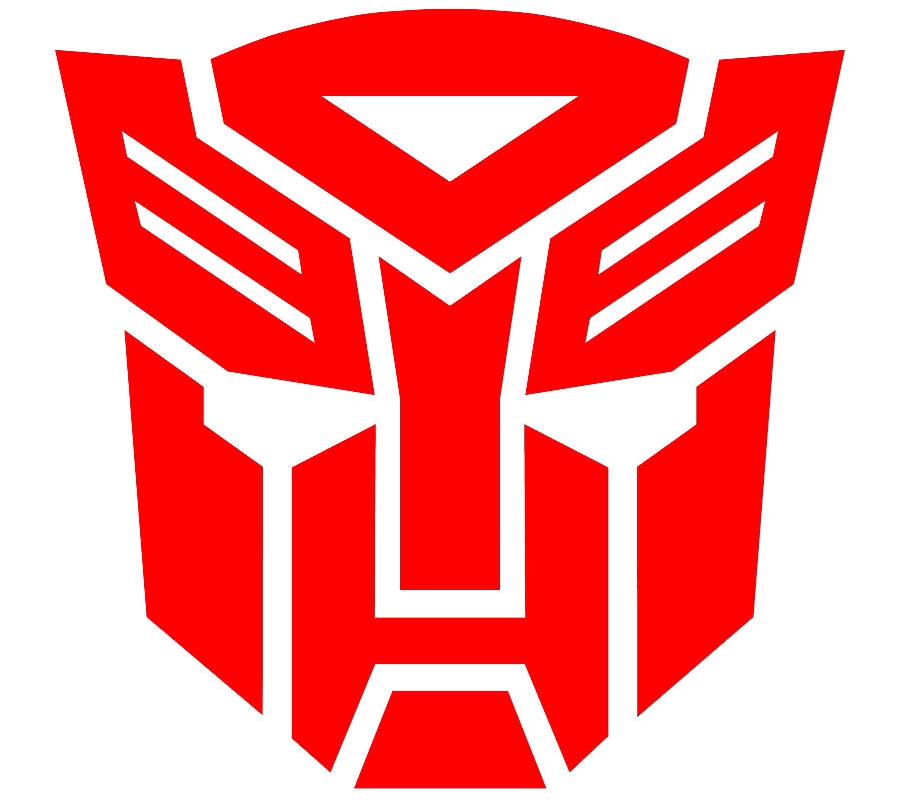
There is every possibility that the author of the symbol was inspired by the head of Prowl’s toy. In the Marvel Comics, the image is referred to as the “Autobrand” and is considered to resemble the face of the Last Autobot. Also, we should point out that in the original animated series, the same symbol referred to the Quintesson slave brand.
The Autobot symbol has not stayed the same, it has been given a quite a few facelifts depending on the visual concept of the series. However, the overall shape and the basic lines have always stayed the same, providing visual identity.
Decepticon emblem

Most certainly, the source of the emblem was Soundwave’s toy’s head. As for the cartoon series, it probably came from the same source as the Autobot symbol.
Font
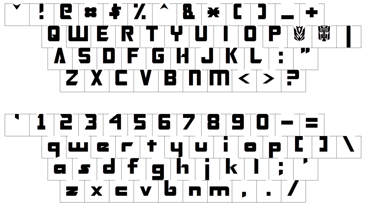
The logo features a solid all-cap typeface. Generally, the type is clean and easy-to-read, yet it has several elements making it unique and recognizable. Probably the most noticeable of them is the letter “A”, which resembles a triangle where one side is “half-open”.
Color
![]()
The current wordmark is given in red, while the previous one featured several shades of metallic grey as well as a black outline. Both the logos are written against the white background.


